Text and Layering
Sketch 101
Design a card to use in your web page.


Today’s learning objectives
Yesterday, we designed some primary and secondary interface elements to use in our web layout. Today we’re going to use these buttons to design a “card”, one of the most useful patterns in modern web design. We’ll aim to...
- Consolidate knowledge of the align function
- Learn about using type and text boxes
- Understand the visual design of cards in websites
Reading & doing time: 20 mins
Day 4 Tutorial: Create a card for responsive web design
Today, we’re going to create some “cards” for use in our web layout. You will have seen these all over the web. They are useful because they serve as containers for information that is in a repeating format – for example, items in an online product catalogue. Because a card design usually has a single column layout, they are also useful in responsive web design, where a website has to resize itself to be suitable for viewing on a smartphone. Cards can be laid out side-by-side on desktop, or floated in one long list on mobile.
1. Open up your Sketch document.
Check that you’re working in a duplicate artboard named “Day 4”. Next, to create the background for our card design, let’s draw a rectangle. Initially, let’s make the rectangle 276 * 426 pixels, and give it a light fill color. Also, let’s remove any borders from the shape, and set the corner radius to 16 pixels.
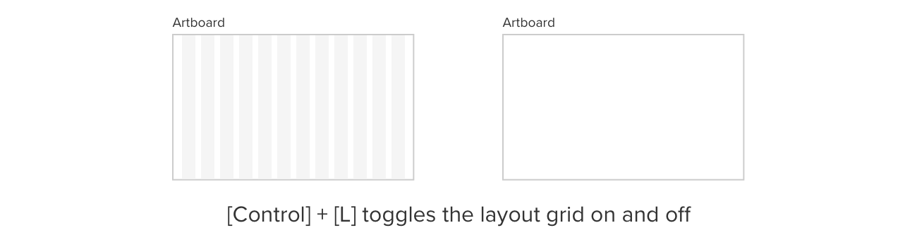
2. Practice toggling the layout guides off and on
By the way, if you ever find the grid columns annoying while working in Sketch, you can toggle the guides on and off using [control] + [L]. You can also go into this menu: View > Canvas > Layout Settings, and change how dark the shading in the guides is. Or you can choose just to have a stroke outline of each column instead of grey blocks.
3. Add a circle
Next, let’s create a circular placeholder at the top of each card, where an image could go. Imagine that this image is going to be someone’s profile picture. Press [O] to bring up the ellipse tool. Create a circle, by constraining the ellipse tool by holding down [shift]. Let’s make the circle 92 pixels wide, and place it at the top of your card design. Make sure it is centered relative to the card background, using the alignment buttons if necessary (at the top of the Inspector panel).

4. Add a text heading
Next, let’s create a heading for the card. Press [T] to select the “Text box” tool, then drag out a text box that’s 145px wide and 16px high. (Remember, you can make fine adjustments to size in the top-right of the Inspector panel.) Type “Heading” as placeholder text for now. Next, let’s set the font to Roboto. Set the size to 13 pixels, and make the text uppercase by going to the “Type” menu at the top of the screen, and selecting “Uppercase”.
5. Position the text heading
Make sure the heading is centered relative to the card background (the rectangle) – remember the “Align Horizontally” tool we learned yesterday. Then position the heading slightly below the circle you already created. Let’s say 8 pixels below – you can check this by selecting the text box, holding down [alt], and then hovering the mouse pointer over the circle.
6. Rename the text heading
Let’s call it “Card Heading”.
7. Add another text box for body text
And next, another text box, this time a bigger one, to contain more detailed body text for the card. Let’s make this 174px wide and 133px high. Let’s rename this layer as well, this time to “Card Body Text”.
8. Paste in some placeholder text
Copy the following placeholder text to the clipboard, and then paste it into the body text: Lorem ipsum dolor sit amet, consectetur adipiscing elit, sed do eiusmod tempor incididunt ut labore et dolore magna aliqua. If you’re pasting in text from a webpage or other “rich text” source, you can remove all the formatting from that text by copying it to the clipboard, then pasting it into a plain text document in TextEdit, then copying it to the clipboard *again*, and finally pasting it into Sketch.
9. Add the button
Duplicate the primary button you created yesterday, and drag it to the bottom of the card. You could change the text to say “Read more”.
10. Duplicate your artboard
And rename it “Day 5” ready for tomorrow!
Day 4 done already? Soon you’ll be a Sketch pro! Things get exciting tomorrow as we learn to use Symbols. Any questions about what we covered today? Just leave a comment below, or find us in the Twittersphere.
Bonus material

Symbols
Learn what Symbols are in Sketch and why they are valuable.