


Corner Radius, Text, and Grouping
Sketch 101
Create buttons with the corner radius setting and the type tool.


Today’s learning objectives:
Yesterday, we learned how to use shapes in Sketch and applied that knowledge to create a simple logo. Our next step is to start creating some interface elements to use in our design. To do this, we’ll be aiming to...
- Reinforce learning of the Sketch interface and of shapes and points
- Learn about the corner radius setting
- Create different sizes and shapes of text box
- Group elements
- Understand the visual design of buttons in user interfaces
Reading & doing time: 20 mins
Day 3 Tutorial: Create primary and secondary interface buttons
1. Open up your Sketch document.
Make sure that you have duplicated your artboard from the end of yesterday and made a “Day 3” artboard! Next, press [R] to select the rectangle tool. Drag out a rectangle across 2 columns so that the dimensions are 180 pixels by 60 pixels. If it’s not quite right, you can edit the dimensions in top-right of the Inspector.
2. Rename your object
Press ⌘ + [R] and rename the object to “Button”.
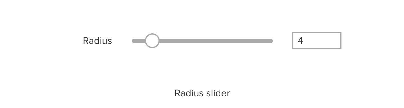
3. Make the button rounded
To round the ends of the button, we need to use the “Radius” slider in the Inspector. Because the height of the rectangle is 60px, in order to create a semicircle at the end of the rectangle, we just need to set the radius to 30px (30px for each of the two corners at each ends = 60px in total). However, we can set this to any value above 30px and get the same result.
4. Pick a color for the button
Change the border and fill for the button. Turn off the border by un-checking it in the Inspector, and change the fill to color #0078A0. This is called a “hex code” (hex is short for “hexadecimal” – the numbers and letters express the red, green and blue value of the hue – RRGGBB).
5. Add a text label to the button
Press [T] to select the Text Box tool. Drag a text box over the button and type “Button” as a placeholder for now. Tap once outside the text box, and, making sure that the text box is selected, head over to the Inspector on the right. Change the text size to 24px, center-align the text, and set the text color to white (#FFFFFF in hex).
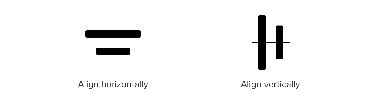
6. Align the label and the button
Click and drag around both the button and the text label. This will select them both at the same time. Next, use the alignment tools at the very top of the Inspector. With both objects selected, click “align horizontally”, then click “align vertically”. The text should now be centered in the button – if it’s not, check the steps above and make sure you didn’t miss anything!
7. Duplicate your button
Drag a marquee around the rectangle and text box that make up your button. Press ⌘ + [D] and they will be duplicated on top of the current objects. Drag these objects to the right so that they have their own space.
8. Create a secondary button
You’ll probably have spotted that websites often have a primary button and secondary buttons. The primary button tends to be brightly colored and filled, while secondary buttons often have a lighter fill or just an outline. So next, let’s create a secondary button based on our primary button.
Select the rounded rectangle from your duplicate button. Un-check the “fill” setting so that the background is clear (white, presuming that your artboard background is white). Next, let’s make the border a bit thicker, setting it to 3px. Change the border color to the background color of your primary button – #0078A0. Instead of typing this color in, you could use the color dropper tool to pick the color directly from your primary button. Finally, select the text box and change its color to #0078A0 as well. Now you have a secondary button!
9. Group your button elements
Finally, let’s group each of these buttons separately using ⌘ + [G], and then rename each one using ⌘ + [R], changing the names to “Primary Button” and “Secondary Button”.
10. Duplicate your artboard
And rename it “Day 4” ready for tomorrow!
Day 3 is done and dusted! Are you starting to get used to working in Sketch? How does the interface compare with other products you’re used to? Let us know in the comments or just head to our Twitter and holler!
Bonus material

Text and Layering
Design a card to use in your web page.
