


Today, we launched our new brand identity and website – and we’re so excited to share it with our community and the world. This rebrand is the result of countless hours of work over many months. While we’re generally of the mind that brands ought to speak for themselves, given that our business sits at the intersection of design and education, we thought the community would be particularly interested to get a behind-the-scenes look at how this new brand came to be.
A Long Time Coming
Designlab is a little more than ten years old (founded in 2013), and the previous incarnation of the brand was largely in place from the beginning. “The original logo and fonts were all there from the very start,” recounts Designlab Co-Founder and CEO Harish Venkatesan. “Over the years, the brand evolved a bit organically, but we never really stopped and thought intentionally about updating the brand until more recently.”
The impetus for the rebrand was the natural progression of our product and audience. When Designlab first launched, the business primarily focused on teaching design to non-designers who wanted to round out their skillset – marketers, product managers, and the like. Over time, some of these individuals began stacking multiple Designlab courses together and transitioning into design careers. From these early examples, our flagship program, UX Academy, was born. As time went on, the original cohorts of UX Academy graduates matured in their careers and today many are senior designers, design managers, and leaders of teams.
“Although career-switchers remain a core part of our business,” said Venkatesan, “going forward we see programs and courses for mid-career and senior designers to be an increasingly integral part of our offerings. So given that our audience is one with a maturing set of design sensibilities, we felt it important for our brand to follow suit and feel elevated from a design perspective, while still staying true to its roots.”
Finding an Outside Perspective
Once the team committed to go forward with a full rebrand, we decided to seek the services of a brand agency to help us with the process. While design is undoubtedly in our DNA, as a business we’ve primarily focused on UX and product design – brand design, while adjacent, is largely a different discipline. Further, rebrands aren’t just about visuals. If anything, storytelling is an even more important part of the process, and we thought it best to get an outside perspective on our story by using an external agency. After a thorough vetting process, we settled on Toronto-based agency, Whitman Emorson. We could tell you about them, but we’d prefer to let them tell you about themselves:
Started in New York and based in Toronto, Whitman Emorson is a design studio that solves complex problems with a human touch. Female-founded and led, we’re a team of creative thinkers—designers, strategists and writers—bound by the desire to produce strategic, thoughtful and responsive work. Clients become long-standing partners and collaborators as we strive to understand your organization’s needs and deliver on strategic and creative opportunities.
We couldn’t have said it better ourselves.

The Discovery Phase
Whitman Emorson began their engagement with us by auditing the Designlab brand. This meant looking at instances of how the brand was showing up in various forms and channels – not just from a visual perspective but also in terms of tone of voice, messaging, positioning, and more. From there the agency also did a similar audit of the industry as a whole to understand how Designlab sat among its peers – and begin to understand what a future facing brand could and should look like. “One of the things we found when looking at other players in Designlab’s space,” said Hannah Siklos, Business Director at Whitman Emorson, “was that there weren't a lot of examples of other organizations who were really leading with design. Rather, we found a lot of similarities between various brands in the space, using similar color palettes, imagery… even down to iconography. So it felt like there was an opportunity for Designlab to put design more at the forefront of the brand.”
A “Human-Centered” Brand
One of the themes that emerged from Whitman Emorson’s research of our users and our brand was that of “human centeredness” and that our students, alumni, and mentors overwhelmingly felt a kind of connectedness to the Designlab community. This manifested itself for our users both in feeling that Designlab was “invested in student success” and “a feeling of not being alone in the learning journey.” As such, we wanted to make sure that this human centeredness came through in our updated brand – both from a visual and a messaging perspective.
[MID_ARTICLE_CTA]
Three Potential Directions
Whitman Emorson explored three potential visual directions for us to take the brand in. Below we touch on these three directions – although for brevity, we’re only showing a small sample of the work we were presented with.
Concept 1: The Starting Block
Guiding question:
What if Designlab’s identity was built on the most foundational element in digital design?
This direction started with the pixel and then built our logo and iconography in a number of creative ways:


Below you can see a number of the aspects of this brand direction, including color, fonts, and illustration style:


Our Initial Reaction:
While there was no single opinion across the team, overall we really liked this direction and found it authoritative and bold; however, it was perhaps not quite approachable enough given the importance of human-centeredness to the brand.
Concept 2: Play with Purpose
Guiding questions:
What if Designlab’s identity was rooted in design principles yet flexible and responsive to various expressions?
What if it acted as a foundation for which its community could explore, learn and grow?
This concept started with a rather straightforward logo, but then played with type and color in novel ways:


Below you can see a number of the aspects of this brand direction, from the logo to illustrations to the bold secondary color palette that would complement white and black:

One proposal for this brand direction was to even let site visitors pick their own colorway:


Our Initial Reaction:
This was a really fun exploration and definitely the most “outside the box.” Further, several people on the team really liked how the bold secondary color palette paired with white and black. That said, some worried whether it was too “out there” and not sufficiently practical. Additionally, several people on the team had concerns regarding the difficulty of executing such a brand.
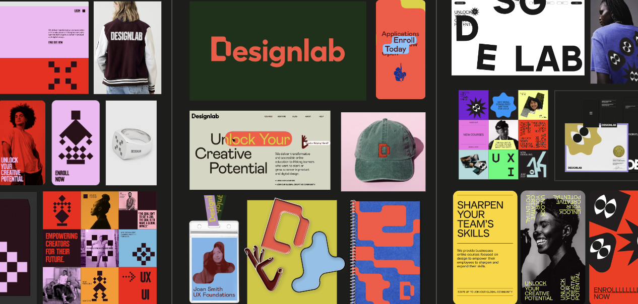
Concept 3: Pathways to Potential
Guiding questions:
What if Designlab’s identity evolved as its industry, offering, and community did? And reflected learners’ diverse journey to unlocking their creative potential?
This concept had a wide color palette and stood out with its use of shape and illustration:

Again, below some of the aspects of this brand direction, including logo, colors, use of shapes, and illustration:


Our Initial Reaction:
Out of the gate, this was the option that the team gravitated towards the most. The typography and logo felt elevated from a design perspective but also approachable – and the overall look of the brand balanced playfulness and irreverence with also being a little more grounded than “Play with Purpose.” Probably the biggest reservation regarding this direction though was that the color palette felt a little too “retro” for what we wanted from the brand.
Iterating on a Concept
After internal discussions, the team focused in on the “Pathways to Potential” direction. The team went through some iteration on color palette, typography, and illustration style – and eventually came to our final brand direction.
The final wordmark remained the same from the initial exploration:

However, the color palette moved in a much bolder, more modern, direction:

The primary typeface of the new brand is Mabry, with Fig Tree as an alternative and Bitter as a secondary typeface to be used in limited capacities.


One of the unique components of the brand is the use of graphic shapes. Simple graphic shapes are used as buttons, or one line highlights (such as subtitles). Organizational graphics are used for separating blocks of information in a layout. Revealing graphics reveal big headlines and are used in hero moments (such as the header on the website, or on social). Finally, complex graphics are used as patterns in more illustrative moments.

The brand system has “helping hands” that are used to give a sense of humanity to the brand. These hands have different purposes, including "action," "encouragement," and "direction."

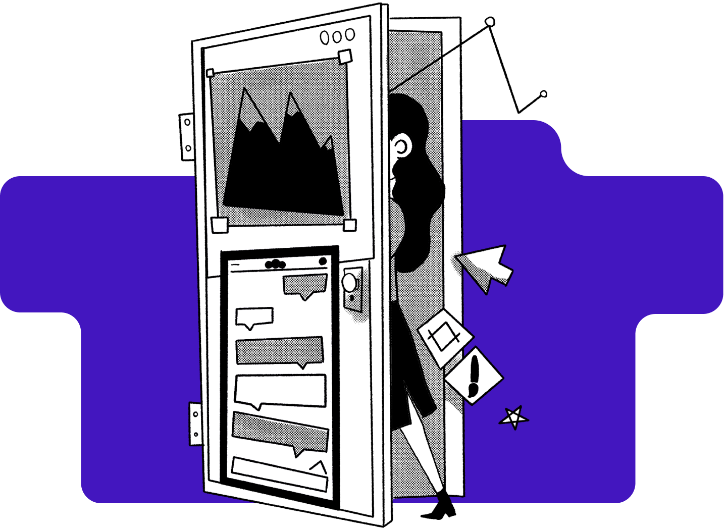
In addition to the illustrated hands, Whitman Emorson also proposed a black and white illustration style using line work, half-tone dots and white and black fills. The below were a samples they curated as inspiration:

Executing the New Brand
Of course, establishing our new brand guidelines was merely the beginning. Even after our brand guidelines were built, we were then faced with the formidable task of executing the new brand across all of our touch points – from commissioning illustration in the new style to creating a new website, to recreating every single email and piece of collateral across the business. A portion of the result of all that work is the website you're on right now.
We hope you like it.


%20(1)-min.png)


