


Your design portfolio plays a key role in your career success. This holds true whether you’re applying for your first UX role or are in the process of leveling up to a more senior product design lead position.
Crafting an impressive design portfolio can be a daunting task, with numerous decisions to navigate. The process can quickly become overwhelming, considering the high stakes involved – making the right choices can lead to exciting job opportunities, while any missteps could potentially impact your chances."
Based on our experience of guiding students through the UX design portfolio process at Designlab, in this post we’re sharing some common mistakes found in design portfolios.
Feel free to treat this as a checklist the next time you’re working on your site!
14 Common UX Portfolio Mistakes to Avoid
Mistake 1: Forgetting the user
Your portfolio site is a UX design project in its own right. It needs to serve a number of user groups, each with a specific set of goals and content needs. As you build or revise your portfolio, take time to empathize with the situations your users are likely to be in.
Common user groups include: hiring managers, recruiters, and potential freelance clients. (These will vary depending on your area of specialization, and the seniority of the roles you’re targeting.)
For example, managers are likely to have dozens or even hundreds of resumes and portfolios to review in a limited time. Making your site easy to navigate shows respect towards those users, and says something important about your values as a designer.
Mistake 2: Showing too much work
When crafting your portfolio, it’s tempting to want to throw an extensive collection of 10, 15, or even 20 projects.
But for your portfolio, less is definitely more.
Since viewers will only click on one or two case studies when reviewing your portfolio, the sweet spot typically lies in the 3-5 range.
A thoughtful curation process involves asking yourself, "If a visitor were to view just one project, would I be content with this being their impression of my work?" By curating with precision, you can present a compelling and impactful portfolio.
Tip: If you have additional projects that you’re proud of and want to incorporate, a common action is to add them to your About page, so that they’re still accessible, but not the first thing that a viewer will click on.
Mistake 3: Showing too little work
On the flip side, having too few projects (less than 3) can negatively impact the impression you leave on your portfolio visitors. This is typically a challenge primarily for those who are first entering the industry—although it can also pose a difficulty if you’ve neglected to update your portfolio throughout the years and only have “old” projects to show.
Most graduates from intensive bootcamps like UX Academy will graduate with three or four in-depth projects from their studies.
However, unless this work is truly exceptional, portfolios with only student work can still feel a little thin. Look for ways to add depth to your portfolio, and aim to get your project count into that range of 3-5 portfolio-quality projects by including personal projects, freelance, and pro-bono work where applicable.
Mistake 4: Too much narrative
There are some fantastic examples of in-depth case studies on more senior designers’ sites—for example, Michael Evensen’s Soundcloud write-up and Simon Pan’s work with Uber—but this content works because it matches how substantial the project is.
However, in-depth written content is typically excessive for a more junior level role or case study. As a general rule of thumb: 3-5 sentences is usually sufficient for each paragraph.
Stay focused on communicating the essential points, and leave the flowery storytelling and details for live conversations.
Mistake 5: Too little narrative
It’s possible to go to the other extreme, and omit the storytelling completely from the project write ups in your portfolio. The problem with this approach is that it asks the user to understand your project through final images alone.
Your audience also wants to understand your design thinking and project process: how you went about defining and solving the design problem, what challenges you overcame, and, ideally, what the results of the work were in business terms.
You can craft a story around your work by including some process images, like sketches, research documents, and wireframes, and incorporating concise, informative passages of narrative text that walk the user through the project.
Aim for around 300-400 words of narrative for each project, clearly structured with headings and bullet points.
Tip: Including insights and reflections can be a great way to communicate more about yourself as a designer, and can help you stand out from the competition.
Mistake 6: Lack of clarity about your project role
Most professional design work is collaborative in some way, and it’s unlikely that you were responsible for 100% of the work on a project.
Be open and transparent about how you contributed to the project. This is also an opportunity to explain how you communicated and collaborated with the rest of the team, and how your contribution is evident in the final results.
Still new to the design world? Be honest about when a project is student work versus “real” work.
[MID_ARTICLE_CTA]
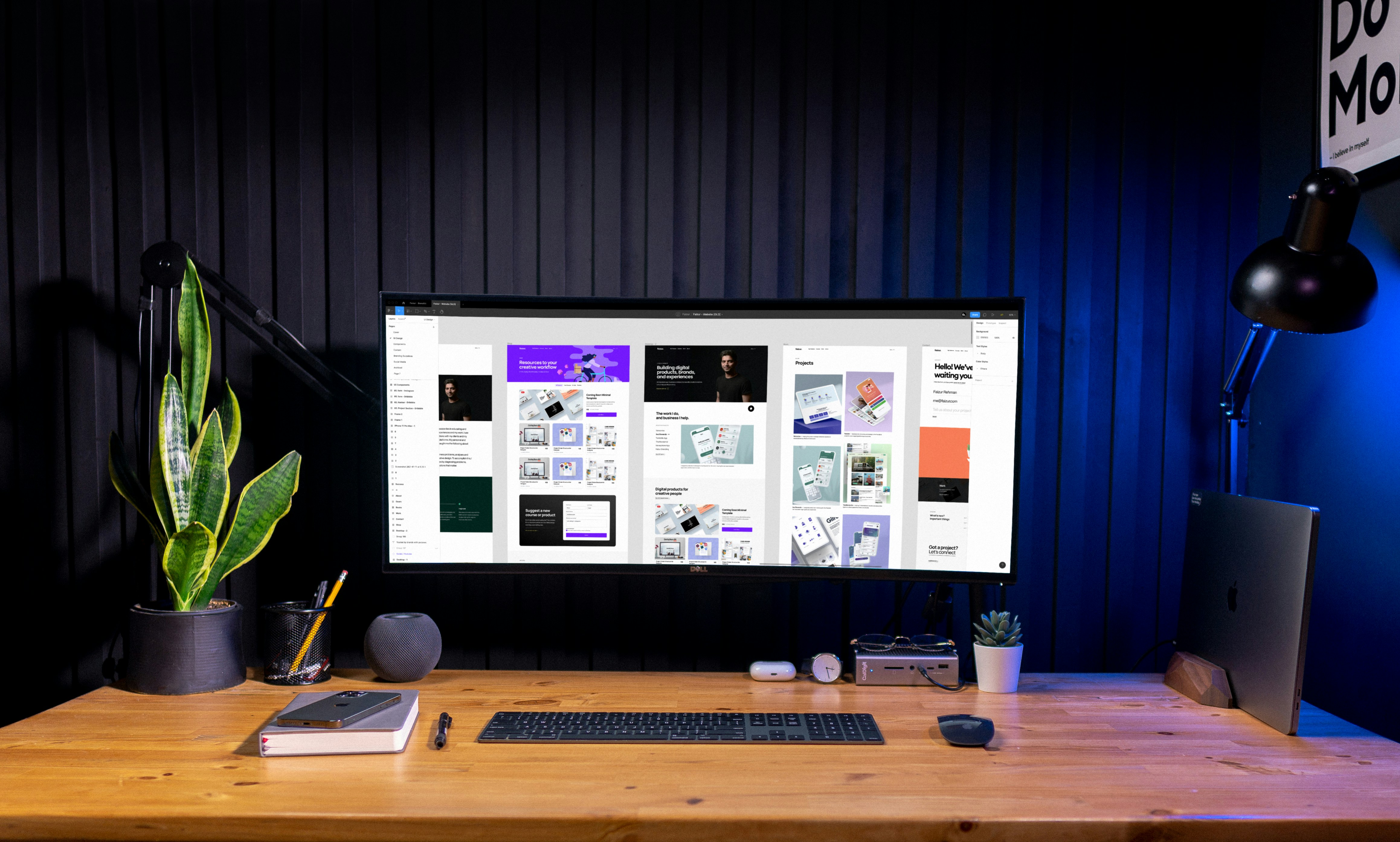
Mistake 7: Using generic images
A red flag in any portfolio is generic photography on the homepage—particularly open roads or tidy desks with a MacBook, a notepad, and a mug of coffee.
You may only have a few seconds to connect with the user before they close your website again—first impressions count, so don’t waste the opportunity to make an impact. Make any images you use meaningful—avoid photos of post-it notes on a wall when that content doesn’t add anything substantial to the narrative around your work.
If you’re using mockups to add depth to your portfolio, make sure to use high-quality templates. It’s worth paying a bit of money for these: they’ll reduce the chances that the same template is being used by many other designers. It’ll also enable you to have a consistent set of mockups that help to unify your portfolio visually.
Mistake 8: Thumbnails that are too small
Your work might be wonderful, but if the user has to click on tiny thumbnail images to get there, they might never see it.
The job of a thumbnail is to show off the content just enough so that the user is curious to see more. Unusable thumbnails may have the opposite effect, and cause people to bounce away from your site before exploring.
Mistake 9: Low-res or too-large images
Getting image resolution and file size right can be tricky, particularly if you’re including a lot of images on a single page.
Ideally, establish the largest size that your image needs to appear on your site. For example, if your template is 960 pixels wide at viewport size, you’ll want to save out images at retina (2x) resolution. So you’ll need image files that are 1920 pixels wide so that they’ll appear sharp on retina screens.
Keep in mind when images are at retina resolution, files can start to get very large and cause usability issues with page load times. While some websites might auto-optimize images, it’s always a good practice to keep your uploaded image sizes at a recommended size. (Some recommendations are 2MB or less for background images, and 200KB or less for other images.)
Here are some tips to reduce file size at high resolution:
- Use JPG format for any image that contains significant areas of photographic content.
- Use PNG format for any image that contains web graphics with large areas of flat color.
- When using JPG format, experiment with reducing the quality level down from 12 to 8, 9, or 10. Often there is no noticeable degradation in visual quality, but significant savings in file size.
Mistake 10: Typos—including typos in mockups
Recruiters and hiring managers often look for attention to detail above other qualities. Having typos or formatting errors on your site—or, worse, having them in your project mockups—can be a big turn-off.
Some resources to catch and fix these typos include:
- Asking a friend to read through your content
- Use a tool like Grammarly
- Use a spell checker
- Hire a professional proofreader or copyeditor
Mistake 11: Clichéd homepage intro text
The homepage intro text is your opportunity to establish a standout first impression. But too many designers miss this opportunity by using generic intro text like:
“Hey, I’m Maria. I’m a UX wizard who loves crafting user-friendly interfaces.”
A simple edit here might include mixing your personal vision statement as a designer with a quirky or whimsical fact about yourself:
“Hey, I’m Maria. I’m on a mission to create a more inclusive digital world…when I’m not walking my poodle on the beach.”
…ok not perfect, but you get the idea.
Mistake 12: Poor responsive experience
Don’t assume that people will be accessing your site on desktop devices: any of your users might be reviewing your site on the move, so make sure the mobile experience is simple and usable.
One trick is to use square (or even slightly portrait) images on your site. This will maximize the size at which your work can be viewed on a smartphone.
Mistake 13: Making your template too complex
A good portfolio is like a gallery: it should be a neutral space that allows people to focus on the work itself. Most of the time with contemporary digital design, that means keeping things pretty simple and minimal.Granted, rules are meant to be broken, and there are certainly tasteful examples of UX/UI portfolios that have done this well…but in general, you’ll want to skip the overly complex or brutalist designs.
Mistake 14: No call-to-action
What do you want people to do? Contact you? Then give them a way to do it, and visually guide them towards that action—perhaps with a prominent “Get in touch” button. Having an easily downloadable one-page resume can also make it much easier for people to remember you and follow up if they’re interested in hiring you.
Links to your Dribbble, LinkedIn, and professional Instagram account can also help keep you connected with visitors who appreciated your work.


%20(1)-min.png)

.png)


