


Forms are everywhere. Every time you log into a website, sign up for a newsletter, or reply to a WhatsApp message—you’re using a form.
Forms are crucial for the success of a design, both visually and for business purposes.
From a user interface (UI) design perspective, a form is an element that allows the user to send information to a server. We might imagine a form looking (and behaving) like the piece of paper you fill out when joining a gym.
Since forms are one of the essential ingredients of website functionality, it’s critical for UX/UI designers to get them right. Building effective forms can help you create a much more delightful, usable, and inclusive user interface design—ultimately benefiting both your UX and your project’s goals.
Let’s take a look at exactly what it takes to create impactful form UI designs.
Form Design Fundamentals
Before you begin planning what your form UI design will look like, think through what information you need to gather and how it needs to be organized (this is known as information architecture).
For some forms, doing this will be very simple—perhaps all you need is a text label and an email address input field. Planning a form’s content upfront will reduce the risk that you have to squeeze extra form elements into an already-complete interface design later in the project.
Here are a few things to consider during this initial planning phase:
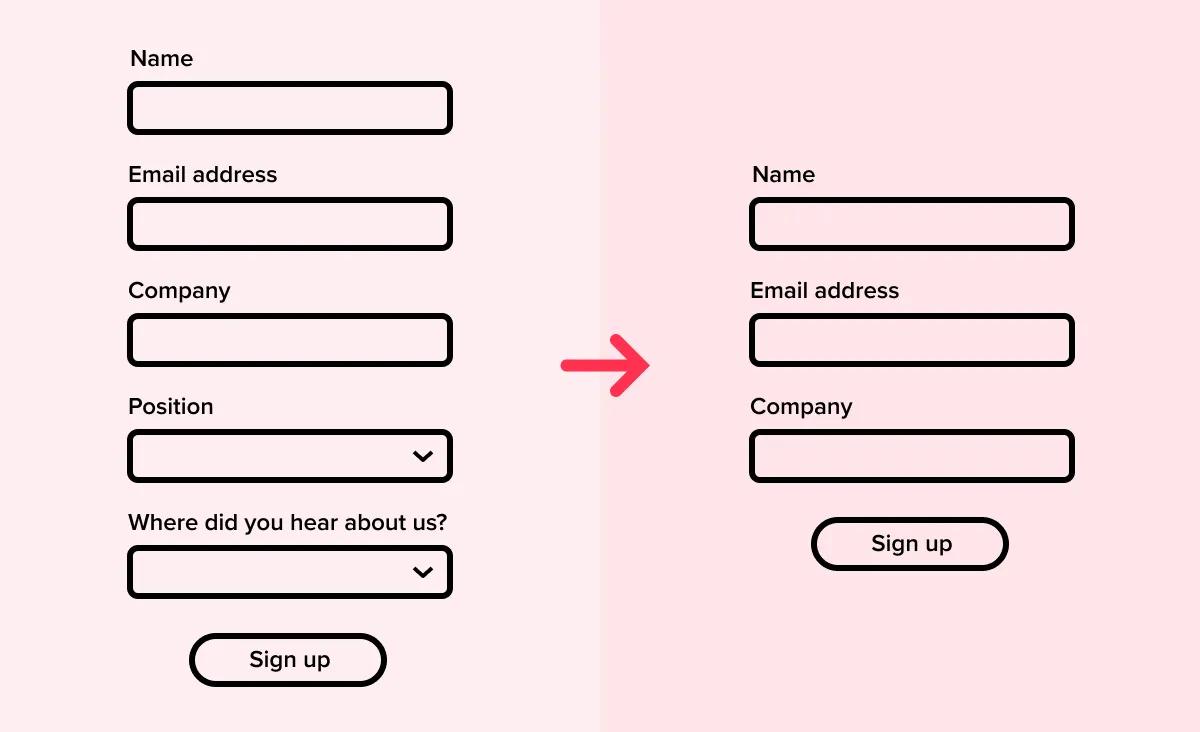
1. Minimize the number of fields
Generally, the more fields in a form, the less likely it is that the user will complete it. In any situation where completion is important (which is almost always), minimize the number of fields you use.
Obvious fields to cut are those that are marked “optional”: if they’re optional, do you actually need the information at all?

2. Clearly mark optional fields
If you do decide to use optional fields, make sure that it’s evident to the user which ones are optional. While marking optional fields with asterisks has become a common design pattern for interface designers, the meaning of the asterisks might not be well understood for the end user. Instead, it is generally less visually threatening to simply mark some fields with the text (optional).

[MID_ARTICLE_CTA]
How to Determine a Hierarchy for Your Form Fields
Here are a few considerations to help you figure out the best way to order your input fields.
3. Keep key constraints top of mind
As you begin to organize the fields on your form, you'll have to determine a hierarchy based on three key constraints:
- Technical needs: the system may need a particular piece of data before it can gather another piece of information, particularly if your form uses conditional logic to determine which fields are displayed to the user at any given time.
- User needs: people generally understand forms best when the information is logically grouped, and when the questions progress from “easiest” to “hardest”. Starting with the easiest questions can help users to achieve early "wins" that will keep them committed to finishing the form questions.
- Business needs: it may be important to the business to minimize flow abandonment, which might mean creating a “milestone submission,” whereby key information is completed by a particular point in the form (a milestone).
4. Group fields logically
When choosing the sequence of your form fields, aim to group them logically and thematically as far as possible. For example, if you are gathering multiple bits of contact information (email, telephone, address), put these together rather than having them appear at different points in the form. So an account creation form might have three sections: “Personal information”, “Payment details”, “Marketing preferences”.
At the micro-level, we are used to seeing certain kinds of information in a particular order: for example, username and then password, or street address and then city. Observing conventions here reduces cognitive load for the user.
5. Group fields visually
Once you have defined those logical groups of information, make sure to also reflect that grouping visually. This can be done simply by adding space between the groups, but you can also consider adding section headings or labels.
How to Design a User-Friendly Form Layout
The goal of your design should be to help users understand and readily complete all components of the form, from input fields to selecting the right radio buttons. Here are a few UI design best practices to guide basic form layout.
6. Place the form carefully in the wider layout
When a user is engaging with a form, it is the center of attention. The form’s position within the web page or app screen should reflect this importance. For example, even a simple signup form should have visual prominence and centrality within the overall design; don’t squish it into a corner or footer as an afterthought.
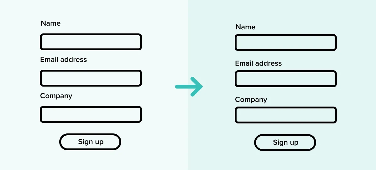
7. Use a one-column layout
Although a one-column layout may be less visually elegant, it has been shown to result in significantly better user understanding, fewer user errors, and higher overall rates of conversion. The reason for this is probably that, in a one-column layout, there are fewer opportunities for the user to “miss” input fields; the eye only needs to travel on a simple vertical journey, rather than in a Z-shaped journey.
When a user misses a field, this has a significantly negative impact both on the time it takes the user to complete the form, and on the level of frustration they experience. It also disrupts any sense that they’re making progress through the form, since they're forced to go backwards and fill out an earlier field. When this happens, users are much more likely to abandon the form entirely.

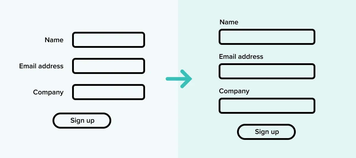
8. Place labels above form elements, not to the left of them
Even in one-column layouts, it’s common to see form labels placed to the left of the input area. However, this means that the user’s eye still has to go on that Z-shaped journey rather than a simple vertical one, which may increase the perception of complexity, fatigue, and slowness.
9. Arrange lists, checkboxes, and radio buttons vertically
This reinforces a vertical journey for the user’s eye, and supports a sense of consistent progress. And again, it makes it less likely that a user will miss options within a list.

10. Group labels and fields visually
As well as using visual grouping at the level of sections, make sure that the form field, the label that relates to it, and any helper text, are also grouped visually and adequately separated from surrounding elements.
11. Use a stepped or multi-screen format for long forms
If you have a large number of text inputs on a single screen, it not only increases the possibility of visual overwhelm, but also increases the risk of a save error.
A simple solution is to split long forms into multiple screens or pages, and give the user insight into how many pages they can expect in the process.

12. Don't split numbers into multiple input fields
Phone numbers and credit card numbers should only ever need to be a single input field. Multiple input fields can cause frustration and errors for users who look at the keyboard while typing.
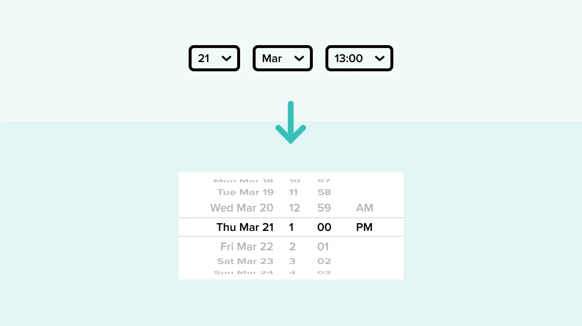
13. On mobile, use native OS features for date pickers and other special inputs
Google’s Android and Apple’s iOS both have built-in interfaces for certain kinds of data entry, like date pickers. Aim to use these native elements wherever possible, rather than programming your own. Users will be more familiar with the native option, and it’s very likely to perform better.
UX Copy Considerations for Form Design
The role of good UX copy is underestimated in form design. Strong copywriting can lead to a much greater number of form submissions and, depending on the functionality of the form, increased revenue for the business.
Here are a few things to keep in mind as you write the copy for your form.
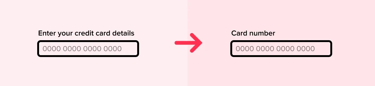
14. Label fields clearly and concisely
Striking the right tone, and communicating labels and instructions clearly and concisely, can significantly increase the user’s trust not only in the form, but in your overall brand.
When writing labels for each form field, aim for the minimum number of words and the maximum amount of clarity. If you anticipate any ambiguity or uncertainty on the part of the user, include some short helper text that gives unequivocal instructions on how to fill out the field.
When designing your form, it can also be helpful to produce multiple options for how each field could be labeled. This enables you to test different labeling options, or at least make an informed choice between the available alternatives.
15. Address users’ concerns in the place they will arise
Whenever you present a form for your user to fill out on your website, whether it’s a simple subscribe or registration form, you’re asking the user to trust you with any and all information that they submit.
Asking for certain information may cause the user to wonder why it is being collected. For example, if you are asking for someone’s phone number, consider including helper text that explains why you need it. (And if you don’t actually need it, don’t ask for it!)

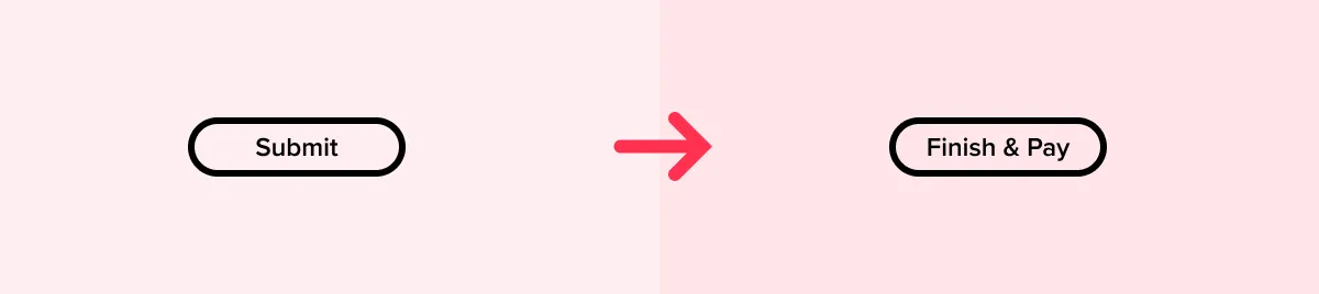
16. Use descriptive, action-based words on buttons
Buttons should describe the action that will be launched by clicking on that button. Sometimes, particularly in more technical applications, “Submit” and “Cancel” are okay, but usually they are too dry and feel too generic. Instead, consider using words or short phrases like “Sign up”, “Send information”, “Create account”.
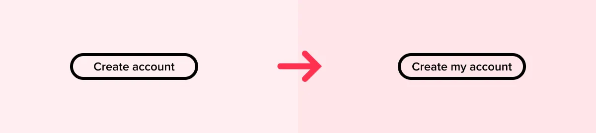
17. Consider using the first-person on buttons
This depends on your brand’s style guide, and the overall tone you want to strike. However, it’s been shown that buttons that include the first person voice (“I”, “me”, “my”) tend to have higher conversion rates. So instead of “Create account”, you could consider “Create my account”. A rule of thumb is that any button text could be preceded by the words “I want to” and make grammatical sense, as well as making emotional sense in context.
18. Don’t use placeholder text as labels
Placeholder text is the text that displays inside a text entry field before you select it. There are a number of problems with using placeholder text as labels, including:
- Placeholder text tends to be grayed out, and is therefore less inclusive and accessible.
- Screen readers generally won’t read out placeholder text, making your form unusable for visually impaired users.
- Placeholder text disappears once you select the field and start typing, meaning the user might forget what they are supposed to be doing.
- Placeholder text should help with data entry format, which it can’t if it’s being used as a label.
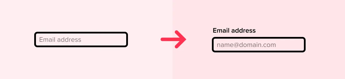
Instead, use both labels and placeholder text to give users the best and most helpful guidance.
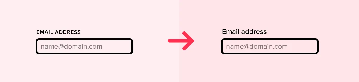
19. Don’t use all-uppercase in labels or placeholder text
Uppercase text is usually harder and slower to read, so don’t use it for the body of your form (including labels, placeholder text, and helper text). Generally uppercase text is okay if used sparingly—for example, in section headings, buttons, and icons.
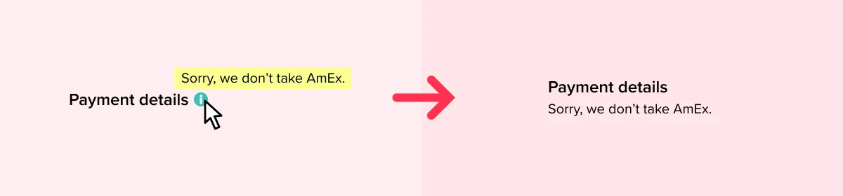
20. Don’t hide helper text
Helper text is instructions or extra guidance beyond just the label—for example, “Password should be 8 or more characters.” If you are using it, display it rather than hiding it behind a question mark icon or tooltip.
21. Make the required input format clear
When entering data like validation codes, phone numbers, or credit card details, users may be unsure whether they can or should include text like brackets, spaces, and dashes. Make the required input clear in helper text—for example “Enter your card number without spaces.” Doing this reduces cognitive load, by taking a decision out of the user’s hands.
22. Shorter is better than longer, as long as nothing essential is missed
We've mentioned this already, but it's worth reiterating: fewer form fields are preferable to more form fields. However, it is counterproductive to make your form so short that it doesn’t actually gather the information you need. In the paradoxical adage occasionally attributed to Albert Einstein, “Everything should be made as simple as possible, but not simpler.”
23. Use confirmation messages where appropriate
Even when a user actively clicks on the “submit” button, you might nevertheless want to consider displaying a confirmation dialog. Again, this might be appropriate in a setting where the action is momentous, or where the user might need reminding to check through what they’ve entered (like sending a job application).
24. Use success states
Once the user has submitted a form, it’s important to display confirmation that the submission was successful. At best, failure to do this means the user is left without a sense of completion. At worst, it could mean the user submits the form again, perhaps placing duplicate orders.

25. Use a sans-serif typeface with a high x-height
Although carefully chosen serif typefaces can work well on forms, generally sans-serifs are a safer option. Many modern sans-serifs—like Roboto, San Francisco, or Proxima Nova—are designed specifically for use on screens. An important feature of these fonts is that they have a large x-height—meaning that the lowercase letters are relatively large.

Usability and Validation
With the form UI design and copy completed, it’s time to review some of the more functional design components and interactions that will have to be communicated with the development team.
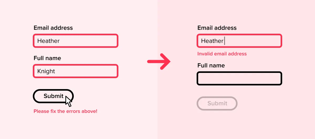
26. Use inline validation in preference to submit validation
It’s better to validate the user’s data entry as it happens, rather than doing all the validation when they try to submit the form or move to the next screen. This is partly because it makes sense to address errors while the user is already thinking about the information, and partly because displaying errors when users submit the form disrupts user progress and makes it more likely they will give up rather than fix the error.
Where appropriate, the system should also offer information that helps the user identify the precise nature of the error—for example, “that doesn’t look like enough numbers,” or “did you mean…?”
27. Don’t use captchas unless absolutely necessary
Captchas are those little boxes where you have to type in the numbers displayed in a grainy image. They have been shown to severely impact flow completion, so wherever conversion is important, captchas shouldn’t be used.
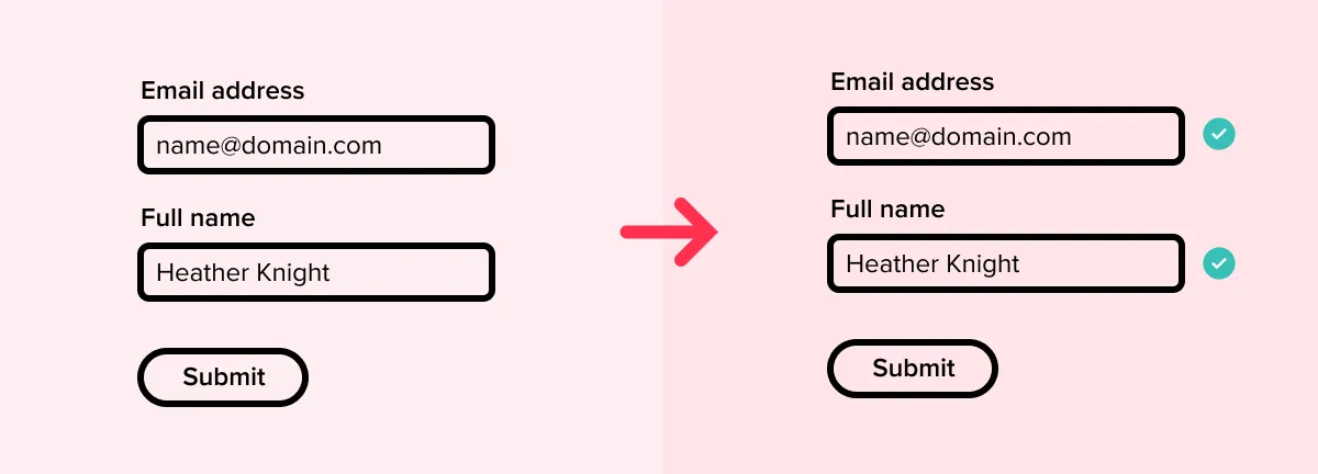
28. Use inline validation to confirm user progress
Use inline validation to confirm that the user is making progress. This could mean a “tick” icon appearing next to fields once they’ve been correctly filled out.
29. Ensure that error messages help the user to fix the error
Don’t assume that error messages are self-explanatory: “invalid data” next to a credit card number probably won’t help the user identify what’s wrong. Instead, use something like “it looks like you missed a number”.
30. Disable the “Next” or “Submit” button until validation is passed
This provides a clear visual indicator to the user that their data entry is ready for submission.

Testing the Effectiveness of Your Form
Just because the form “works” in your design prototype doesn’t mean that it will perform as planned once it’s been implemented in the website or app. The final form design tips are all about the importance of testing—and some of the specific elements that you’ll want to check.
31. Test all form input fields and variables
It’s important to test your form thoroughly before you launch it to your website or app. Some of the areas that you will want to test include:
- Input field date: check to make sure that the data from the form arrives at the proper location.
- Input errors: if a form is filled out incorrectly, do the error messages show as they were designed?
- Conditional logic: if your input fields rely on conditional logic, make sure to test all paths and variables
32. Test and optimize your form for all major browsers
Forms can rely heavily on how the browser is programmed to handle HTML form elements, meaning that different devices and platforms can give rise to unexpected issues. Start with the most common browsers, but don’t neglect the edge cases: according to StatCounter, as of October 2018, over 6% of people are still using Internet Explorer. Further, data entry on mobile is a very different experience than on desktop, so give adequate time and resources to testing and optimization for both device formats.
33. Test the mobile-friendliness of your form
It’s always a good idea to make sure that the form fields are easy to use and submit on the smaller screens of mobile devices. Different devices present different visual and usability constraints. A form that works well as a single screen on desktop may be too much for a single screen on mobile. In this case, it makes sense to switch to a multi-screen pattern on mobile, rather than sticking to a cramped or lengthy single-screen layout.
34. Utilize real users
If you have the time and resources, it’s also valuable to conduct pre-launch user testing with a new form. Doing this will allow you to set participants specific tasks, watch how they respond to the experience of filling out the form, and gather critical feedback from them after they’ve finished.
35. A/B test your form after launch
Testing doesn’t have to end just because you launched your design. You can continue to experiment—for example with different input fields, labels, layouts, and copy—even once your form is live. You can use the A/B testing method to compare the relative performance of different designs, whether in terms of conversion, flow abandonment, time to complete, or other important metrics.

36. Test your form for speed
Form speed is often a neglected consideration during testing. Consider the following metrics:
- Time it takes the system to load and display the form initially
- Time it takes the user to complete the form
- How actual completion time relates to user expectations
- Time it takes the system to process the form and display a completion state or message
Also, bear in mind that a lack of visual interaction design can make the form processing appear to be too fast. A form which moves immediately to the next screen in a multi-screen form can cause the user not to realize that the screen has changed. In this case, consider using a visual transition to help the user understand that the form has moved on to the next screen.
Summary
An effective form UI design doesn’t stop at visual aesthetics. Yes, there are components and design patterns that belong to the field of UI design. But at its core, every form must also include thoughtful UX copy, interaction design, and a holistic understanding of how the user will interact with the form.
Using the fundamental principles listed in this article will help you deliver a delightful experience to users, which you can then test and revise as needed.
Interested in learning more about the fundamentals of UX design? Check out our selection of UX/UI design courses, or dive straight into a new career with our intensive bootcamp UX Academy (the next cohort is starting soon!)


%20(1)-min.png)


