


2019 marks an important anniversary, both in the United States and around the world: it’s 50 years since the “Stonewall Riots”, a moment which came to symbolize the spirit of the ongoing campaign for LGBT+ equality.
So, following on from our series of posts about design history, we’re taking this opportunity to look at the impact of that event on the design language of the LGBT+ rights movement as it progressed over the past five decades. Let’s start with a reminder of what the movement is about, and why it remains as essential today as it was in 1969.
1969: The Stonewall Riots
It might seem like ancient history in countries where relative tolerance of LGBT+ identities is now common, but back in the 1960s things were very different. Most jurisdictions still criminalized and pathologized minority sexual orientations and gender identities. The associated social stigma was extreme, leading to high rates of mental illness and homelessness—problems that persist today.
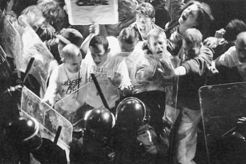
In Manhattan, police regularly raided establishments known to be popular with the LGBT+ community. The Stonewall Inn in Greenwich Village was raided so often that bar staff had devised special methods of hiding alcohol, so that they could resume trading as quickly as possible following a raid.
But on 28 June 1969, one of those raids was met with unexpected resistance. The protests and civil unrest that followed lasted several days, and finally brought LGBT+ issues into the public eye. The unprecedented pushback that police encountered became known as the Stonewall Riots, and began to transform LGBT+ life from a subculture to a social movement. Pro-gay street protests continued in the following days, catching politicians and law enforcement off-guard.
Given the level of oppression and criminalization that the LGBT+ community faced only a few decades ago, it could be tempting to think that today we live in a different time, and that these issues have been addressed. Sadly, this is far from true.
Same-sex marriage is still a contentious issue in many developed countries, and many other inequalities remain unaddressed. Meanwhile, the stigma and oppression facing the global LGBT+ community are extreme and shocking. So the fight for social respect and legal equality continues, with fresh challenges to be faced both at home and around the world.
Black, White, and Bold: the Campaigning Visuals of LGBT+ Design
The gay rights organizations that formed in the U.S.A. during the 1950s and 1960s, such as the Mattachine Society, took a quiet approach to campaigning. Before the breakthrough moment of 1969, these organizations tended to use names that obscured their purpose, and their public campaigning tended to be conciliatory and gradualistic.

But the defiance shown during the Stonewall Riots set the stage for a shift in the tone and visual language of LGBT+ campaigning, and represented a cultural changing-of-the-guard within the gay rights movement. This was reflected in real-time by a plea painted by the Mattachine Society on the boarded-up windows of the Stonewall Inn following the riots:

The graphics of campaign groups in the years that followed the Stonewall Riots showed that this was a campaign built from the ground up. With little organization and few resources to draw on, graphics were initially handmade out of necessity.
As time went on, this graphic style came to represent the reality and authenticity of LGBT+ identities and demands. For centuries, the Queer community had been confined to the shadows. Diverging from the quietism of groups like the Mattachine Society, new campaign groups crafted an aesthetic that was bold, highly visible, and uncompromising.
For example, Gay Liberation Front banners like the one pictured below featured in the 1970 Christopher Street Parade, which is often recognized as the first pride march. It unabashedly uses the term gay, and uses provocative biological iconography that challenged dominant discourses on gender and sexuality.

The Stonewall Riots followed a different kind of breakthrough moment in the U.K. two years earlier, when parliament passed a limited decriminalization bill. But it wasn’t until 2003 that “Section 28”—a law that effectively prohibited the discussion of LGBT+ issues in schools—was repealed. Marriage law and other anti-discrimination measures have only changed within the past decade.
The LGBT+ rights groups that formed in the U.K. during the 1970s drew on similar grassroots visual language. The manifesto of the Gay Liberation Front in the U.K. used hand-drawn illustrations, a black-and-white palette, and graphic references to direct action.


In the 1980s, an unlikely allegiance was formed between gay rights campaigners and another marginalized group in the U.K.—coal miners, who were striking against government industrial policies at the time. The 2014 film Pride dramatizes the evolution of the Lesbians and Gays Support the Miners organization.

During the 1990s and 2000s, the OutRage! Campaign group used stark black-and-white posters, with heavy tabloid-esque text that subtly mocked the reactionary headlines seen in popular newspapers. OutRage! also leveraged populist news obsessions—such as Prince Charles’ remarriage—to bolster its political messages.


This aesthetic remains in today’s LGBT+ graphics. The logo and posters of Queer Nation, a campaign organisation founded in New York City in 1990, references the campaigning at the core of LGBT+ history.


The Rainbow Flag: Pride and Positivity
In stark contrast to all this black and white campaign language is the famous rainbow flag. For many, this—also known as the pride flag—is the most recognisable of all LGBT+ symbols. It was first designed way back in June 1978, by Gilbert Baker, an artist based in San Francisco.
The rainbow is an ancient symbol of hope, plenty, and diversity—from the rainbow that marks the end of Noah’s voyage in the Ark in the bible story, through to gay icon Judy Garland’s “Somewhere Over The Rainbow” in the 1939 film The Wizard of Oz. By the end of the 1970s, the LGBT+ community had won a number of early social and legal victories, and the rainbow perhaps symbolized that the darkest days were over.
The rainbow was also a fitting symbol for the LGBT+ community, which was marked both by its own internal diversity and by the fact it represented a transgressive, nonconforming group in wider culture.

Although for most today the rainbow flag is a simple symbol of pride, Baker’s original eight-color flag assigned specific meanings for each color. From top to bottom, they are: sex, life, healing, sunlight, nature, magic/art, serenity, and spirit.
By 1979 it had been refined to just six. Graphically, the result is simpler and more recognizable—and therefore a more effective branding device.

Rainbow colors are often seen in materials for events that focus on community celebration as well as political campaigning. For example, this poster from the 1983 San Francisco pride parade used a spectrum of colors alongside familiar graphics referencing the need for political action. And Keith Haring’s subversive artwork combined a rainbow palette and stark messages about AIDS, from which he suffered himself.


As cultural discourse has evolved, particularly in the past few years, a number of variations on the rainbow flag have been proposed. For the 25th anniversary of the flag, Baker encouraged a return to the original eight-stripe design, while others added a white stripe to represent the full spectrum of diversity. There are also many more flags that celebrate subcultures within the LGBT+ community, including lesbian, bi, trans, and intersex versions.
The color purple, long associated with LGBT+ culture, has also obtained a special significance since the introduction of Spirit Day on the third Thursday of each October, when people wear purple to symbolise their opposition to homophobic bullying.

From Pink Triangle to Equality: Reclaiming Cultural Symbols
Even in this brief history of LGBT+ design, it’s striking how consistently the movement has reclaimed social and educational symbols from wider culture.
Perhaps the best-known example of this is this is the pink triangle. LGBT+ detainees at Nazi concentration camps were forced to wear this symbol, in a downward-pointing orientation, to mark them out.
During and after the 1980s, a reclaimed and inverted version of this symbol was used in awareness campaigns during the AIDS epidemic. It is associated in particular with the ACT-UP organization (AIDS Coalition to Unleash Power), which ran the well-known “Silence=Death” campaign.
In the U.K., the Campaign for Homosexual Equality also used the triangle in their campaign against Section 28, and it's featured in countless other campaigns.

The use of repurposed biological male and female symbols was also a way of subverting what many in the LGBT+ movement saw as the heterosexist bias of scientific as well as social discourse: the American Psychiatric Association removed homosexuality from its official list of mental illnesses only in 1973.


In recent years, the equals symbol has been used in many campaigns for same-sex marriage. Although more subtle, this was also a means of reclaiming a symbol from wider discourse in order to challenge mainstream attitudes.
Until recently, LGBT+ political campaigning was often framed in terms of “gay rights”. This invited accusations of special pleading from opponents. A series of campaigns around the world, primarily focused on the legalisation of same-sex marriage, saw a shift towards the language of equality. A number of variations of the equality logo emerged through these campaigns.

This was an inspired choice of graphic, because it took something that most people already agreed with—the principle of equal treatment—and invited them to see how that equality was not yet achieved for LGBT+ people. By framing same-sex marriage as an issue of equality, many were persuaded to see things differently.
By persuading people in a way that leveraged their innate human need to hold an internally consistent moral code, the equal marriage campaign is also an excellent example of effective UX design applied to political campaigning.
Effects on wider branding
As social justice movements have gained in confidence in recent years, the tone and visual style of their campaigns have also increasingly made their way into mainstream branding and advertising campaign design.
Many of the themes that we find in LGBT+ campaigns—stark, bold, grassroots graphics—have been transformed into media strategies for the mass market. Here, for example, is Coca-Cola’s version of the marriage equality device:

While many in the movement might ask where the big brands were in the toughest days of the campaign for equality, the effect of the LGBT+ movement on branding and design nevertheless goes further than simply a logo set in rainbow colors.
Whatever we might think about corporate motivations in aligning themselves with grassroots LGBT+ movements, one thing that this trend shows is that design practices are politically situated. Whether or not a design conveys explicit political messages, it can’t help but have an orientation relative to wider discourse.
In campaigns like Gillette’s recent campaign “The Best Men Can Be”, we can see a thread connecting the campaign graphics of the 1960s and 1970s and contemporary branding. In videos like this, brands leverage Generation Z’s visual language, and, at least on the surface, align themselves with the urgency of today’s calls for social justice.
Thanks for reading!
In this piece we’ve only scratched the surface of LGBT+ design history.
Looking back over the past 50 years brings out the intersectionality of the LGBT+ rights campaign and other liberation movements—in particular, the fact that 50 years of LGBT+ rights campaigning has taken place in within societies that remain stubbornly sexist and patriarchal, meaning that gay men were listened to long before queer women, trans people, and LGBT+ people of color.
NYC artist, author, and designer Adam J. Kurtz makes this point neatly in his 2018 99U talk:
For a more thorough look at these complexities, check out the excellent book Queer: A Graphic History by Meg-John Barker and illustrated by Julia Scheeler.
We also recommend exploring the links below. Thanks for reading!
Further Resources
- Stonewall Forever commemorates the Stonewall Riots
- 7 Queer Artists Who Are Changing The Game in 2018 (Them)
- Type With Pride: download “Gilbert”, a free rainbow font to honor Gilbert Baker
- 100+ LGBT+ Creative Trailblazers (Campaign)
- The Phluid Project offers gender-free clothing
- Championing Diversity: Meet the LGBT+ Creative Leaders of Tomorrow (The Dots)
- LGBT Art History (Revel & Riot)


%20(1)-min.png)


