


UX/UI and graphic designers have many things in common. Among them is the practice of using grid layouts to structure their designs—both on and off the screen.
Grid system layouts come in all shapes and sizes, depending on what you’re designing, and have a long history that stretches back to humankind’s very earliest manuscripts.
In this article, we’re first going to bring some clarity by defining what a grid is, and then look at some of the most important types of grids used in print, web, and UX/UI design. Finally, we’ll share five top tips to remember as you start using grids in your own UX/UI design work.
What Are Grid Systems in Design?
A grid is a system for organizing layout in design.
Traditionally, graphic designers have used grid layouts for print materials (like books, magazines, or posters). UX/UI designers also work extensively with grid layouts, since they serve as a foundational structure for interface designs (like web pages, mobile apps, and other digital interfaces).
Not only do grids help to visually organize design elements, but they also serve as a vehicle to improve the user experience by enhancing readability, clarifying information architecture, and providing a framework for responsive design.
Learn More: Guide to Information Architecture in UX
Why Are Grid Systems Important?
It can be tempting to view having to work within the constraints of grid systems as a negative thing—particularly when it comes to creativity. After all, pushing the boundaries of design means eliminating the rules that hold us back…right?
Experience, though, tells us that creativity isn’t that black-and-white.
If you’ve ever been faced with a creative block, you might know how terrifying a blank page can be.
It’s in this situation that creative constraints are extremely valuable. Rather than restricting creativity, constraints give us a starting point and invest the freedom to explore possible solutions. The value of creative constraints is why the best designers always insist on working from a robust design brief, which defines the project’s requirements.
Apart from giving a starting point for creative direction, grid systems are a practical necessity. They provide a structure for layout and visual organization, while simultaneously delivering a framework that developers can then follow to ensure the design behaves as intended, regardless of the device used.
6 Examples of Grid Systems
Each type of grid serves a different purpose. Some of the main examples from graphic and UX/UI design are:
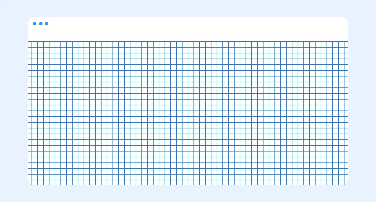
1. Baseline Grid

A baseline grid is a dense grid of equally spaced horizontal lines that determine where text will sit. Baseline grids are often used in combination with column grids, to make sure that the lines of text in each column align uniformly across a spread. A simple example of a baseline grid is a sheet of ruled paper, like you probably used at school.
2. Column Grid

This is the most common type of grid used by designers. It involves taking a page and splitting it into a number of vertical fields, which objects are then aligned to. Newspapers and magazines use column grids extensively.
3. Modular Grid

Kind of an extension of the column grid, a modular grid involves taking a column grid and adding rows to it. The intersecting rows and columns create “modules” that can then be used to govern layout decisions. Magazines and corporate reports often use modular grids.
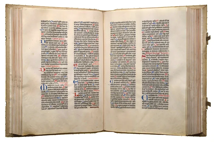
4. Manuscript Grid

This is a one-column grid that simply determines where in a page the text will sit. Classic, “traditional” books use a manuscript grid, with the layouts of facing pages mirroring one another.
5. Pixel Grid
If you’ve ever zoomed in close to a Photoshop document, you might have seen a pixel grid pop up. Digital screens are made up of a microscopic grid of millions of pixels, and sometimes designers get in close to edit images pixel-by-pixel.
6. Hierarchical Grid

A hierarchical grid refers to any irregular grid that accommodates specific content needs. A hierarchical grid may be completely freeform, or it might be composed of two superimposed grids, or other additional grid elements.
Many modern website interfaces utilize hierarchical grid layouts to avoid a box-like feel.
[MID_ARTICLE_CTA]
The Early History of Grids
It’s likely that the oldest grid system was something resembling the baseline grid: guidelines—or “helper lines”—drawn onto ancient manuscripts that aided the scribe in creating text that was straight and evenly spaced. Simple column grids can be found in the Dead Sea Scrolls, where they serve to organize text into readable blocks within a long, rolled-up document.

Some 1500 years later, this same principle was readily transferred to early western printing press machines, which required metal blocks of “movable type” to be loaded, one letter at a time, into a series of lines, to be manually inked and then pressed onto paper.
The Gutenberg Bible—the first western book printed using movable type—uses a two-column grid.
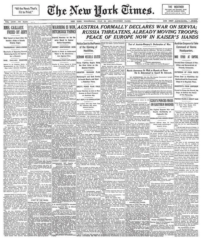
Newspapers from the late 19th and early 20th century expanded their use of large column grids, because they maximized the amount of information they could fit on a sheet of newsprint.
On a large piece of paper like a broadsheet newsprint (which is about 30 inches by 23 inches), using columns means that a smaller type size could be used (often 8pt), and a short line length sustained within each column, maintaining readability. Without columns, the lines would be too long and difficult to follow.
Grid Design in the 20th Century
The grid system is an aid, not a guarantee. It permits a number of possible uses and each designer can look for a solution appropriate to his personal style. But one must learn how to use the grid; it is an art that requires practice.
—Josef Müller-Brockmann
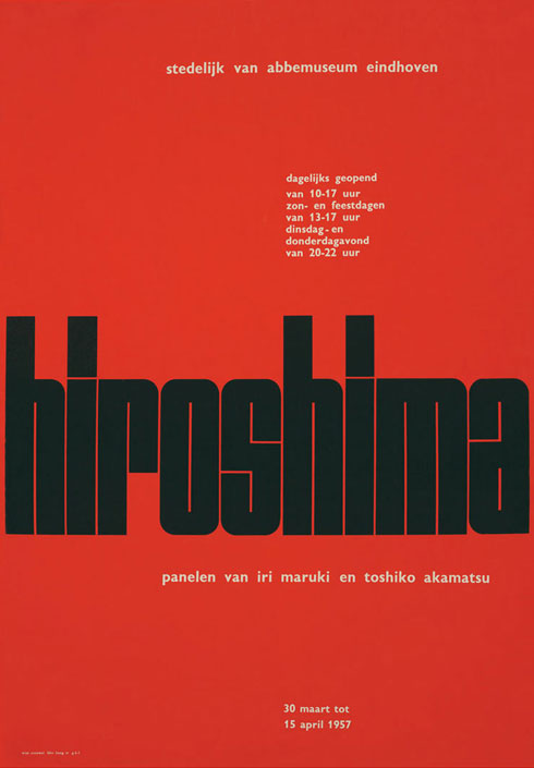
Grids began to get more interesting in the early 20th century, when avant garde designers began to experiment more with layout after being inspired by movements like Bauhaus and De Stijl. For example, mid-century designers Jan Tschichold and Josef Müller-Brockmann developed new grid systems in the form of sparse, typographic layouts and poster designs.
Müller-Brockmann in particular—one of the main exponents of the Swiss Style—pushed the limits of grids by creating modular and rotated grid systems. In his handbook Grid Systems in Graphic Design, he discusses in depth how to choose margin widths that are both visually interesting and functional, and covers tricky details like how to place page numbers in relation to the grid.
One of Müller-Brockmann’s most important insights is that the success of a grid depends not just on how elements are placed within it, but also on how the grid itself is positioned in relation to its container. Today, in print design, the container is typically the page, and in web or UI design, it’s usually the browser window.
The title of the book is even slightly misleading to modern readers, because Müller Brockmann focuses as much, if not more, on the choice and management of type than strictly on the use of layout grids. In historical perspective, this reflects how abstract grid systems emerged from the writing and printing of text; for Müller-Brockmann, grids and text were inseparable. In essence, grids began as a system for organizing text, and so they remain today.
Indeed, Müller-Brockmann’s recommendations for print layouts derive all modular decisions about grid rows and vertical gutters from the baseline text grid. He calls each of the resulting modules “fields”.
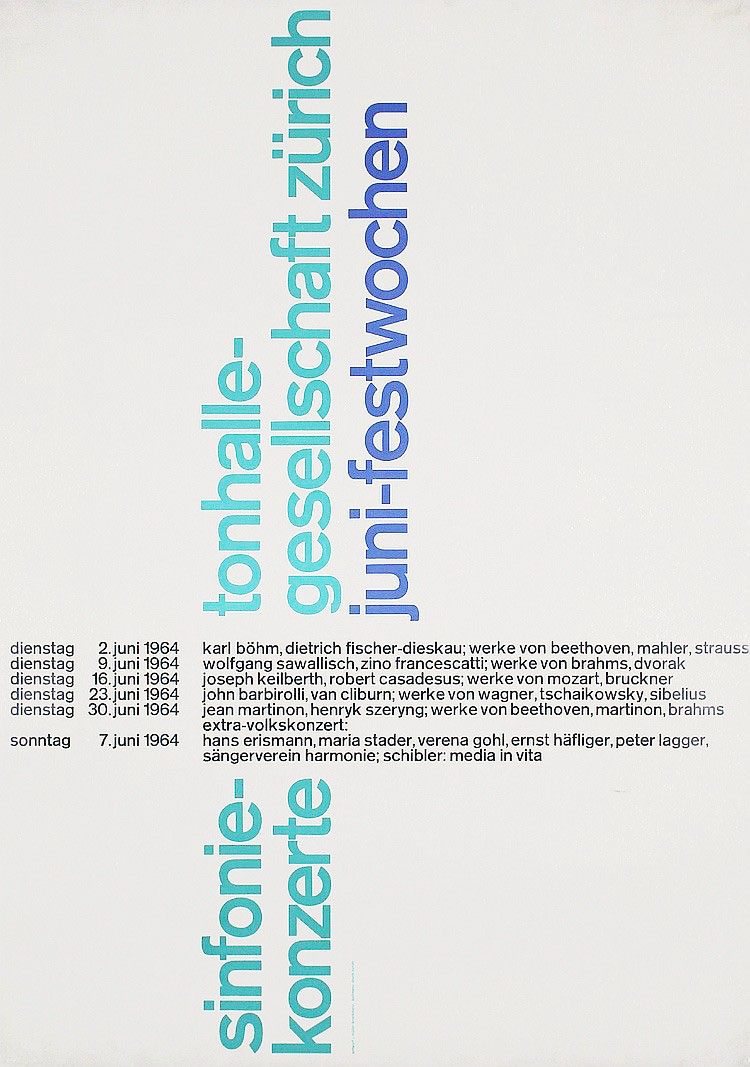

Poster designs from the 1950s and 60s by Joseph Müller-Brockmann, demonstrating modular, rotated, and even radial grids.
An incredible number of possibilities are created through the modular system that Müller-Brockmann developed, and the influence of his work can be seen in much graphic and web design today. For example, we can see a digital version of Müller-Brockmann’s modular system at work on the Guardian’s website (albeit without the baseline alignment):

Müller-Brockmann even explored the application of grid systems to 3D spaces, and grid systems have had a significant impact on the design of exhibition spaces, and on corporate interior design.
As a kind of postscript to the book, Müller-Brockmann looks at ancient “systems of order” drawn from nature and earlier human civilizations. As examples, he identifies honeycombs made by bees, and primitive maps of the proportions of the human body. He also looks at Egyptian pictograms, the Gutenberg bible, and music manuscript (which is a kind of detailed grid system, if you think about it). He also covers the geometry of traditional Japanese architecture, and even the support structure for the roof at London’s Crystal Palace.
Connecting this history to the modern designer’s practice, he concluded the book with this passage:
More and more, clients expect the designer’s work to be logical and systematic, not only on economic grounds but also with a view to image creation and cultivation, for a unified conception for a corporate identity cannot be produced by creativity which is solely emotional in origin. Design demands to a very high degree of not only emotional but also intellectual capacity for creative achievement.
—Josef Müller-Brockmann
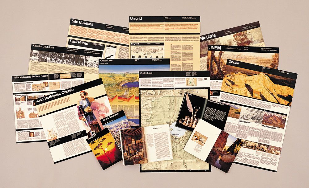
In the second half of the 20th century, many more designers became celebrated exponents of grid systems. Take, for example, Massimo Vignelli and Wim Crouwel. Vignelli favored strict modular grid systems for his countless book designs, as well as in his work on public information materials for clients like the U.S. National Park Service and the New York Subway. Crouwel is particularly noted for his grid-based typography.

Vignelli developed this highly flexible “Unigrid” system for the U.S. National Parks Service, accommodating a wide range of document sizes and formats.
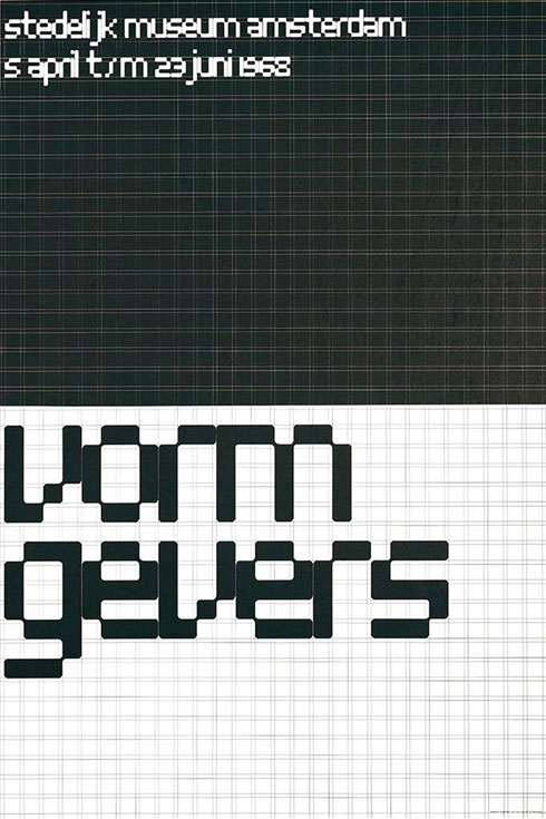
Wim Crouwel used grid systems to develop experimental typefaces.
21st Century Rebellion Against the Grid
The revolution in computing and design software began in the 1970s, took hold in the 80s and 90s, and continues to this day. As well as rapidly changing the tools and techniques used by typesetters and printers, it created new opportunities for experimentation amongst designers.
Historically, grids were a critical tool in allowing typesetters and printers to organize text and other graphic elements in a consistent and reproducible way. It was possible to break the grid and manipulate type, as Wolfgang Weingart did while a printing apprentice. However, achieving these alternative effects meant subverting how conventional printing presses were designed to work.
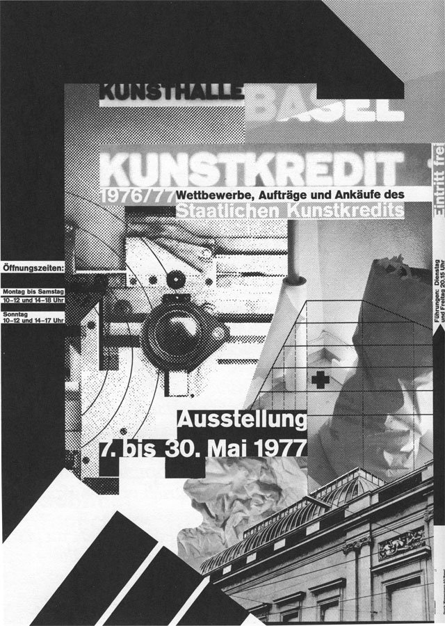
Weingart’s typographic experiments both worked with and subverted grid-based design.
With the arrival of desktop publishing, these technical and formal constraints—which had both informed and reflected the use of grids in graphic design—were removed.
Even the earliest graphic design software, like Pagemaker and Photoshop, let you change up your grids with the click of a mouse. Images could be rotated, distorted, and layered. Whole publications could be mocked up quickly and cheaply on screen, without having to commit each experiment to a costly printing process.
This opened up a new era of experimentation in graphic design—one of the clearest historical illustrations of how new technical tools and constraints can drive the creation of novel work.
One of the best known figures to emerge from the experimentation of the 1980s and 1990s was David Carson, a professional surfer who developed an interest in graphic design. He initially learned his trade through a two-week graphics course at the University of Arizona, another short course in Oregon, and a 3-week workshop in Switzerland. Carson is one of the finest examples of how to become a designer without going to design school.
Carson’s designs are notable for a number of breaks with graphic design convention, including the use of standard grids. However, there are enough grid elements left intact to preserve the design’s fundamental purpose–to communicate meaning.

Although the columns of text are of different widths and are not separated by a gutter, each block of text still adheres to a baseline grid and clear left-and-right boundaries, so the text ultimately remains readable.
Grids in UX/UI Design
Apart from the visual structure they provide for digital interfaces, grid systems and layouts serve a functional purpose as well. For UX and UI designers today, column grids are an indispensable tool in creating designs that have enough structure to allow them to be flexible across multiple devices.
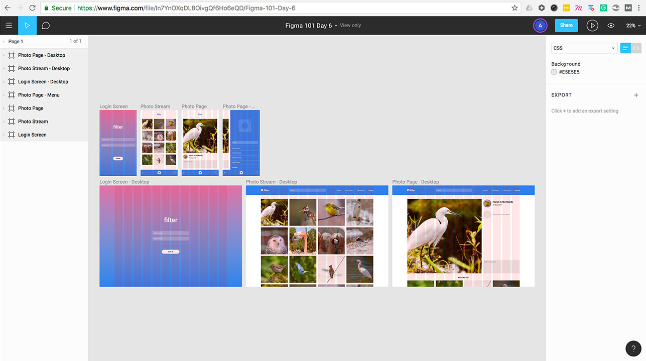
Discovering column grids with Figma 101.
For example, in the free Figma 101 email course, you can create an app design using a 3-column grid for mobile, and then translate that design to a wider 12-column grid for desktop. This way of working is fundamental to the efficient creation of app designs today.
As designers pass their polished UIs off to developers, there are systems like Flexbox, Tailwind, and CSS Grid which offer a basic framework for faithfully implementing grid systems in websites and apps.
5 Tips for Using a Grid In UX/UI Design
As you begin experimenting with grid systems in your work, there are a few key takeaways that can help you move forward with impactful, flexible designs:
1. Plan how the grid relates to its container

In his book Grid Systems, Josef Müller-Brockmann emphasized that how a grid is positioned within the page—how the margins are set up—can have a big impact on how the grid performs, both functionally and aesthetically.
2. Don’t just design with a grid—design the grid

When opening up a new design file to work on a website or app design, it’s tempting to start with your “usual” grid—perhaps a number of columns you’re used to, or a gutter width you always use.
For many projects, this makes sense, since you might be working within the constraints of an existing project.
But it’s always worth taking time to work out what kind of grid your project actually needs, and whether there are additional considerations that might come into play. This second check can save you from getting locked into a grid that doesn’t actually work, or that hinders the functionality of your project.
3. Always begin and end elements in a grid field—not in the gutter

The gutter—the empty space between columns—should be used to separate elements. Text and graphics can span multiple columns, of course–but they should begin and end at the edge of a column, not in the gutter.
4. Don’t forget about baseline alignment

Making sure that all the text in a column-based design also sticks to a consistent baseline can make a big difference to the sense of harmony and organization on a page. Baseline alignment is easily overlooked in digital design projects (as opposed to graphic design, where it is front and center), but it can make the difference between a balanced design and something that just feels off.
5. Consider using an 8pt grid for UX/UI design

Today our designs have to work and look crisp across a range of devices and screen resolutions. Using dimensions and spacing that are multiples of a base number helps to make these transitions clean and systematic. It is now common to use an 8pt grid, because it means designs can scale perfectly on retina screens, and works whether you are using vector or pixel based designs.
Learn More: Check out Google’s Material Design guidelines on 4px and 8px grid principles
Key Takeaways
- Grid layouts play an aesthetic and functional role for UX/UI designers, and ultimately deliver a structure that will ensure the content is accessible and responsive.
- Grid systems have played an integral role throughout visual design history, from the earliest manuscripts to the printing press to modern interface design practices.
- The 8-pt grid has become a standard, especially when designing with retina screens in mind.
Interested in kickstarting your UX/UI design career by learning design best practices like grid systems (and how to apply them)? UX Academy is an all-in-one UX bootcamp with in-depth course materials, 1:1 mentorship, and career support to help you land your dream job as a UX/UI designer.


%20(1)-min.png)


