If you hadn’t heard yet, Netflix recently released a series of eight 40-minute documentaries entitled Abstract: The Art of Design.
The series has divided critical opinion. Some have praised a show that has brought the creative worlds of eight leading designers into the view of a mainstream audience. Others have criticised the show for lacking a critical angle, for focusing too much on the personalities rather the work, and for perpetuating an unhelpful myth about design: namely that it is primarily about aesthetics (“art”) rather than problem-solving.
Abstract is best thought of as profiles of 8 different designers. What we learn about those designers’ professions, we learn by hearing their perspective — and in episodes where the perspective presented is quite limited, the viewer does feel that lack of insight. This was particularly noticeable in the episodes on stage designer Es Devlin and car designer Ralph Gilles. Emotionally, I was left in no doubt about their individual excellence, but intellectually, I didn’t learn much about their process, their teams, or the bigger picture of their disciplines. Put simply, some episodes of Abstract treat their subject too superficially, and as a result test the viewer’s patience.
However, there are three brilliant episodes. These also happen to be the installments that are likely to be of most interest to graphic designers. They are focused on Christoph Niemann, an illustrator formerly based in New York and now working in Berlin; Paula Scher, a graphic designer esteemed for her brand systems and innovative use of typography; and the British–Greek photographer Platon, who has produced some of the most iconic portraits of the past twenty years.
Read on to find out more about those 3 must-see episodes. You can watch the series over on Netflix.
1. Christoph Niemann: Constraints and Creativity
In the first episode of the series, we see into the world of illustrator and designer Christoph Niemann. Although he doesn’t talk in these terms, what we learn about most in this episode is the creative importance of constraints.
Niemann’s emphasis on abstraction is itself a constraint—one that says the end result must have nothing unnecessary. As he puts it, “the abstraction for me is this idea of getting rid of everything that is not essential to making a point.”
He shows us a number of projects that are defined by completely arbitrary constraints. First, we see a little book in which he took a flat iron symbol, and, by rotating it, scaling it, and duplicating it, transformed it to fill a whole volume with pictures of other objects.
Later on, we see his “Sunday Sketches”, which started as an Instagram project. It involves creating a whimsical composition out of the everyday objects found around him. The one pictured below is one of my favorites, but you can find lots more examples here.
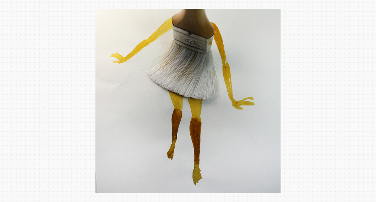
The constraints here are multiple: 1) the constraint of routine—doing it weekly; 2) the fact that it has to be a (square) image to upload to Instagram; and 3) the constraint of taking an everyday object and, through looking at it creatively, turning it to a new, disruptive or subversive visual purpose.
The whimsy of his solutions to this miniature task each day points us to an important truth: that art isn’t so much about creating something new, but about taking something we already know and making us see it differently, whether in the simple visual sense, or in terms of how we understand its meaning.
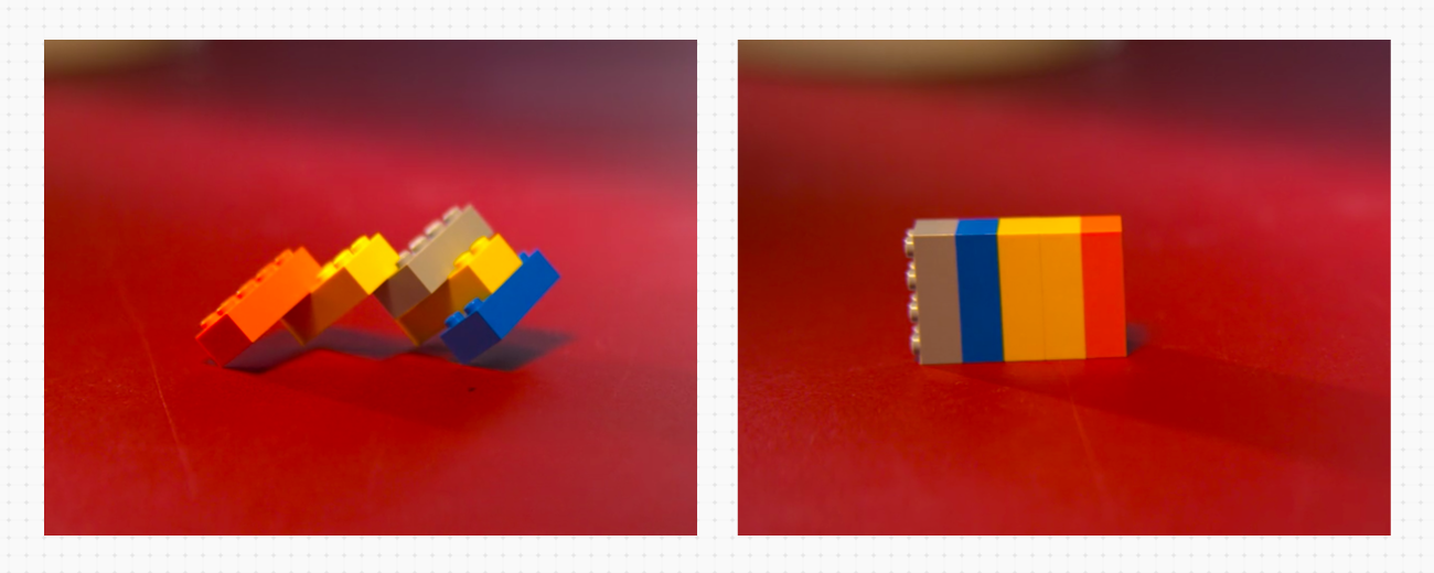
Niemann’s Lego model of his family on a bad day (left) and a good day (right)
A final example of Niemann’s technique of imposing constraints on his work is his use of Lego to express ideas. He explains: “It’s the restriction of Lego, the restriction of very low resolution—it’s almost like a 3 dimensional pixel drawing—that I enjoy so much.”
3 Christoph Niemann Quotes From Episode 1:
-
On inspiration: “Chuck Close said, ‘Inspiration is for amateurs. Us professionals, we just go to work in the morning.’ One thing I love about that quote is that it relieves you of a lot of pressure. It’s just about showing up and getting started. All that matters is you have to sit at your desk and draw, and hope for the best.”
-
On design: “It’s extremely exciting, but it never becomes easy.”
-
On improving: “You have to practice and become better. Every athlete and musician has to practice every day. Why should it be different for artists?”
2. Paula Scher: Painting With Words
In Episode 6, we see into the creative and personal life of Paula Scher, a graphic designer legendary for her innovative use of typography, particularly in logos and brand systems. “Typography is painting with words,” she tells us. “That’s my high.”
One of the virtues of this episode is that, unlike most other episodes of Abstract, we get to see and hear quite a bit from Scher’s fellow design professionals. That includes members of the team working under her direction at Pentagram, as well as senior Pentagram partners like Michael Bierut, and Scher’s husband Seymour Chwast, who she met on the job in 1970. “Pentagram is a design co-operative,” she explains. “There’s no boss. Just friends.”
Scher presents her work for New York’s Public Theater in some detail. We hear how in 1994 the theater lacked a unified brand identity, or even a unified name. Inspired by the varied weights of American wood type, Scher created a logo for “The Public” that evokes the diversity and energy of the people of New York City.
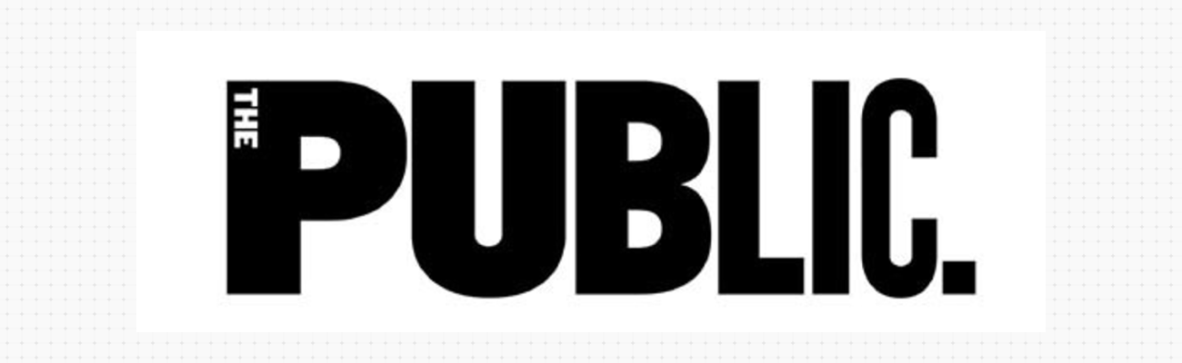
The resulting brand identity feels inclusive, inviting the audience in on their own terms. Bierut hymns Scher’s work on this project, saying that “she figured out how to take what she saw on stage and turn it into ink on paper”.
Scher is one of the older designers featured in Abstract, which gives us an opportunity to hear about how the technological changes of the past 30 years have affected her work. Having painted her typography by hand as a young designer, she describes the sense of physical loss she experienced when computers came to dominate the industry from the 1990s onwards.
While other designers are seen working at desks in offices, we see Scher either engaged in conversations at Pentagram, in meetings showing work to clients, or at home in Connecticut painting in her studio. Scher says, “I could never walk into an office and sit down at my desk to design. I would accomplish nothing. I can sit down at my desk to read my email.”
3 Paula Scher Quotes From Episode 6:
-
On play: “You have to be in a state of play to design. If you’re not in a state of play, you can't make anything.”
-
On clients: “They want proof that this is really going to work. The problem is that there isn’t proof.”
-
On hope: “I’m driven by the hope that I haven’t made my best work yet. What can I make next?”
3. Platon: Photographer For The Twenty-First Century
The inclusion of photographer Platon in a series about design is a provocation, but ultimately an insightful and constructive one. Platon is a Greek–British photographer who initially trained in graphic design, and is now best known for contributing some of the most iconic images of twenty-first century world leaders to publications like Time Magazine.
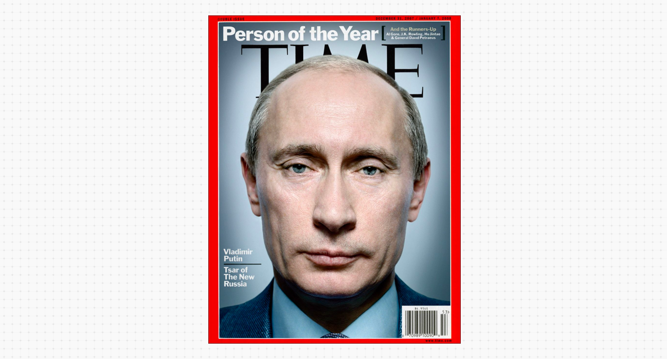
In Episode 7 of Abstract we shadow him on a number of jobs, including a portrait of former US Secretary of State Colin Powell, and portraits of the people of rural Greece. Each project is presented as a design problem that requires a solution. Of course, the methods needed to solve that problem are quite different from those demanded by the work of Christoph Niemann or Paula Scher.
The problem in each case is this: how to make a connection with his sitter, so that, through the image, the audience will have a chance to experience that connection too. At the opening of the episode, he says: “The camera is nothing more than a tool. Communication, simplicity, shapes on a page. What’s important is the story, the message, the feeling, the connection. How do you make this reach people?”
What is striking is the immense skill Platon demonstrates in managing his subjects. He establishes rapport without faking intimacy—breaking through the walls that his subject, consciously or unconsciously, tries to put between themselves and the camera, but not losing the dignity or separation of his sitter.
This connection could be destroyed so easily by the slightest misstep on his part, and as a viewer I felt that fragility. Initially sceptical, by the end of this episode I was in awe both of how Platon handles these moments, and of the professionalism that saturates his work.
This was particularly apparent when we had the privilege of witnessing his session photographing Congolese women who had been victims of rape as a weapon of war. This was a highly moving segment, and the planning, control, and emotional involvement required of the photographer was clear.
Certainly not all photography is design, in the same way that not all typing is design. But I think photography done the Platon way surely is. If you watch only one episode from the series, make it this one—and see if you agree.
3 Platon Quotes From Episode 7:
-
On photography: “Before I shoot, I’m not thinking, ‘How can I get a good picture?’ but ‘What can I learn from this person?’”
-
On design: “I don’t believe you should ever allow your tools to dominate the message. Great design is when all those things take a back seat and you get the message.”
-
On preparation: “If I get it wrong, I can do great harm. It’s really important that my homework is done.”
Why not start with a short course? We offers flexible, part-time short courses including Design 101, Branding, and UI Design. Click here to save your seat!


%20(1)-min.png)