


In Part 1 of this series, we explored the history of user interface design, from MS-DOS and Windows 1 through to iOS and Material Design.
In this second installment, we take a look at what UI design means in today’s market, and examine what separates good and bad interfaces. We also discuss why looks aren’t everything. Finally, we sneak a peek at some of the new patterns emerging in UI design—including Google’s “Fuchsia” and Microsoft's “Fluent Design”, and point you to a bunch of great resources to help you get started in UI Design.
Read Part 1 here: From MS-DOS to Material Design—A Brief History of User Interfaces
4. What does UI design mean today?
Today’s UI designers are usually already designing interfaces for apps within an operating system. Many of the parameters of a user interface are therefore outside of the designer’s control. For example, if a UI designer is working on an Android app, they have no say over the screen size and resolution of the user’s device; of how the user has set up their notifications; or of whether they’ve installed another app to reprofile the color on the device’s display.
UI designers who are working on apps are, instead, usually trying to work creatively within the constraints of a given device and its OS. What’s more, their job is often to comply or cohere with the guidelines of the OS developer (Google for Android, Apple for iOS). Apple publishes list of UI dos and don’ts for developers, as well as a detailed set of Human Interface Guidelines, and Google has a comprehensive visual and UI style guide called Material Design. Check out Google’s explainer video here:
It’s partly because of these constraints that the focus of today’s UI designers is often on the fine detail of how screen layouts are designed, and how smoothly a user can move through stages in their journey through an app or website. Feeling short of time is an almost universal experience in modern life, and users have very little patience with interfaces that feel slow, clunky, or hard to understand.
Here are a few typical features of visual user interfaces today.
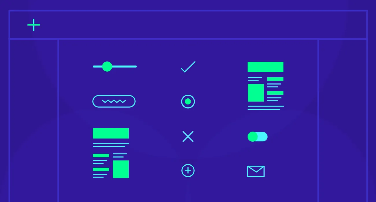
We can understand many UI elements as invitations to the user to interact with the app or device in a particular way.

Text input & cursor invite the user to type in some text, and a Submit button invites the user to click or tap to proceed.

A toggle, here represented by a sliding switch, invites the user to enable or disable an option.
![]()
An icon invites the user to click or tap to open another app or function.

When selected, perhaps using a hamburger button...

...a menu appears and invites the user to choose from extra options.

A slider invites the user to tap/click and drag to change a setting like screen brightness.

A dropdown menu invites the user to click or tap, and then to select an option from a list.
These are just a few examples of UI elements, and there are lots more where they came from. But they give you an idea of the patterns that today's designers use when crafting user interfaces, as they seek to add to a product's value by designing a pleasant and efficient front-end user experience.
5. UI: the good, the bad, and the ugly
You’ll already have worked out that good UI design isn’t all about making something look pretty. UI design can be effective without being aesthetically beautiful, and gorgeous visual design and snazzy effects all too often conceal an unusable product.
Let’s take a look at a some mockups of good and bad UI design. Then we’ll look at a (slightly) ugly one… which is important too (you’ll see why!).
Good UI
...is designed around a thorough understanding of the user, their needs, and the range of journeys they might need to follow through an app, website, or other product. That’s why we say that UI design is an aspect of UX design.
A good interface will be as simple as possible, while still giving the user all the information they need for the task at hand. The navigation is typically short and flat (no sub-sub-sub-sections in menus), it takes a minimum number of steps to complete a task (e.g. checkout), and the options presented on each screen are clear.

In this app mockup, the UI presents the user with three options: search for takeouts using their current location, search “manually” by zip code, or tap the hamburger button for more options.
Bad UI
...tends to prioritise the developer’s or product’s priorities over the needs of the user. Symptoms of bad UI include excessive data entry, long forms, buttons that are too small to tap on accurately, too much text, text that is too small to read easily, use of jargon instead of plain English (e.g. “Bad credentials” instead of “That username and password didn’t work”), and use of intrusive dialog boxes instead of the notification bar.

Does this look familiar? In this mockup, a dialog box from a background app interrupts the active app and demands a response before the user can continue what they were doing. If the user was typing but not looking at the screen, they might lose work. The buttons are small and hard to tap accurately. The error message “unknown error” is meaningless to the user and does not help them to investigate or address its cause.
Ugly UI
...is an interesting one. Some of the most effective UI out there, on the face of it, violates UI designers’ general preference for simplicity. Consider Amazon’s website, which has a busy appearance to say the least:

But, as we know from Amazon’s market share, this UI works brilliantly for their customers. One of the secrets to its success is to have made improvements to the site very gradually and incrementally, meaning that there was no disruption in the user’s experience of the site.
As a customer, I’ve been visiting Amazon for years, and have never consciously noticed any change in its look and feel, or in the way I need to interact with it. And yet… this is how its front page looked 10 years ago (according to the WayBackMachine):

6. What does the future hold for UI design?
The most important change currently happening in UI design is probably the development of voice interfaces. These already feature in every mainstream operating system, though, at the time of writing, few people use voice interfaces on their phones and computers with any regularity. If you’re interested in reading more about our predictions for the future role of voice interfaces, check out our recent article, “Where Will UX Design Be In 5 Years?”
Although new forms of user interface are emerging, sophisticated visual UI is likely to remain users’ primary mode of interaction with most devices. But there is, of course, plenty of scope for innovation and optimisation in “conventional” UI design.
Unsurprisingly, big players like Microsoft and Google invest significant resources in behind-the-scenes experiments with new UI aesthetics and interaction patterns.
In the past few months, we’ve been hearing more about Microsoft’s upcoming “Fluent Design”, which aims to integrate greater visual depth and motion, as well as Google’s experimental OS, codenamed “Fuchsia”, which attempts to do away with homescreens and icon grids.
What do you think the future holds for UI design? Share this article and let us know!
7. How to get started in UI design
If this week’s posts have piqued your interest in user interface design, why not make a start with some of these resources and design challenges?
Read up on typography in UI design:
-
Design Instruct: The Basics of Typography
-
Viljami Salminen’s: Typography for User Interfaces
Read up on color in UI design:
-
Erik D. Kennedy: Color in UI Design: A (Practical) Framework
Understand the difference between UX and UI:
-
Erik Flowers: UX is not UI
-
Amanda Cline: The difference between UX and UI design
List a few websites or apps whose UI design you love.
-
For each one, write up a description of their UI design, paying attention to typography, color, layout, etc.
-
Try reproducing a one of these UIs in your preferred design tool (Sketch, Illustrator, Photoshop, etc.)
List a few websites or apps whose UI design you find clunky or frustrating.
-
For each one, write up a description of their UI design, paying attention to typography, color, layout, etc.
-
Pick one of these examples, and have a go at sketching some possible redesigns on paper. You could focus on just one page or screen, or make it into a bigger project.
Explore some further reading
-
The Core Principles of UI design, by Jane Portman.
-
Google’s Material Design guidelines for the UI of apps being developed to run on Android. They also have a UI best practice guide for Android developers.
-
Apple’s latest UI dos and don’ts for iOS developers.
-
Paul Boag explains how the bad UI design of his bank’s mobile app made him switch banks.
-
Jon Yablonksi on reducing complexity in UI design.
-
User Interface design patterns are available over at UIPatterns.
Looking for more? The links and resources above are just a taster of what you can learn in our 4-week, mentor-led course in UI Design. Find out more


%20(1)-min.png)