


In many countries, making physical stores and services accessible to those with impaired vision, hearing, or mobility is a legal requirement.
Back in 1990, the US introduced the Americans with Disabilities Act (ADA), which enforced standards to improve the accessibility of public spaces and workplaces. And in the UK, the 2010 Equality Act requires—with very few exceptions—all places of business to install ramps to facilitate independent access for wheelchair users.
However, the internet can still be a bit of a wild west when it comes to accessibility. We’re currently working to build a design system that improves the accessibility of Designlab’s website and learning platform. We’ve made progress, and are releasing regular updates, but still have a way to go.
In the course of developing our new design system, we’ve noticed that there isn’t much easy-to-use guidance about designing for inclusion. So, in this piece, we’ve rounded up the most important and immediately implementable tips for UI designers, and packaged them up into a concise list of dos and don’ts.
At the end of the article, you can also download a PDF checklist of these tips for quick reference. We hope you find it helpful!
Article outline
- Accessibility vs Inclusion
- Process
- Text and Typography
- Color and Contrast
- Navigation and Interaction
- Scalability
- Images and Videos
- Engineering and Markup
- PDF Checklist
Accessibility vs Inclusion
Before diving into the tips, just one note on terminology. When we’re designing, it’s tempting to think in terms of “regular” users as the main focus, and then to treat users with any kind of impairment as an edge case for which we might need to compromise our core design. It's this kind of approach that gave rise to the concept of “accessibility”—modifying a “normal” experience to be more usable for another user group.
For a number of reasons, “accessibility” isn’t a great way of thinking about these issues. First, for most products and services, users groups or user personas will be defined by their relationship to the product or service, not by whatever abilities and disabilities they might have in interacting with your app or website.
But just as importantly, the accessibility approach ignores how widespread and varied our disabilities and impairments are. In this article over at UX Magazine, Jennifer Aldrich argues that we should all move towards thinking of ourselves as “temporarily abled”—to switch our bias from creating a regular experience for an idealized set of abilities, and towards creating an experience that can accommodate the widest possible range of needs (without having to enable “accessibility options”). And this isn’t just about long-term disabilities; she makes the excellent point that “angry, sobbing, or drunk people may try to use your product”, and this also has an effect on people’s abilities.
Finally, in ethical and social terms, the attitude that disabled users are on the edge of a product’s design—people for whom we need to bend or alter our “main” website or app experience—unnecessarily reinforces the kind of social exclusion and marginalization that people experience in the physical world every day. The tips that we’ve selected in this piece are, therefore, intended as advice on how to make any design more inclusive of all users.

Process
1. Begin every project with an open mind
Perhaps the first thing to recognize when designing for inclusion is that impairments come in many forms. To many of us, the obvious ones are visual and physical disabilities, but we also need to consider that users may suffer from epilepsy, or be on the autistic spectrum, or live with a learning difficulty, dementia, or other cognitive impairment.
Our responsibility as designers is to shape our designs in such a way that interfaces are available to and usable by as many people as possible. In essence, we are designing for humans, and humans span a wide range of experiences, abilities, and aptitudes.
And another important thing to recognize from the outset is that, in the words of Jesse Hausler, “we aren’t designing for designers”. While aesthetics are important—including for usability—we need to remind ourselves that beauty is only one aspect of good design, and in most cases the usability and accessibility of a product are more important than how it looks.
2. Invest in user research
Before considering any of the other tips in this list, make sure that you’re investing adequately in user research right at the beginning of your project. Assumptions in design are dangerous things—and when it comes to accessibility, it’s very hard to understand a user need that you have never yourself experienced.
So, for example, if you’re wanting to ensure that your design is inclusive of those with a visual impairment, engage members of that user group in the research process for your project. If you’re working for a client who doesn’t see the need for research, explain why it’s important for their project, and how the benefits will show in the results they see further down the line.
3. Conduct user testing
The same applies to testing. Even if you have acted on every insight from your research, there will still be subtleties you’ve missed, or ways that the solution you’ve found could be further enhanced with feedback from the user group you’re designing for.
Further reading on inclusive design
- What do we mean by inclusive design? (Inclusive Design Research Centre)
- The difference between inclusive design and accessibility (Eone)
- Microsoft’s inclusive design principles

Text and Typography
4. Set a font size of at least 16px, and ideally 20px for body text
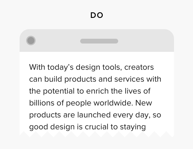
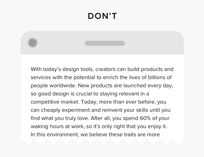
It’s often said that the web is 95% typography. Favoring a larger text size in all areas of a design can significantly ease and enhance the experience for visually impaired users, without having any detrimental effect on other user groups.
5. Where small text has to be used, use uppercase, letter spacing, and a heavier weight

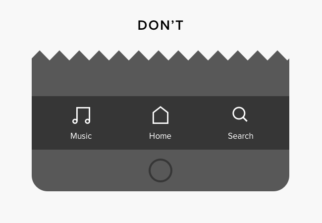
When it comes to screen elements where space is particularly limited, like in top navigation bars and footers, It can be tempting to choose a much smaller text size. For example, at the time of writing, Spotify’s tab bar uses 8px text labels with its icons—and Netflix’s is even smaller.
This kind of decision is usually driven by aesthetic considerations, as well as the desire to cram in more options. Try to avoid using small text, but if there are labels or menu items where text size is a necessary trade-off, consider using all-uppercase, a moderately heavier font weight, and slightly expanded letter-spacing.
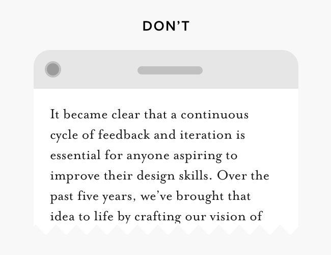
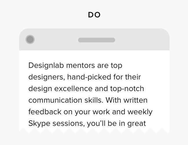
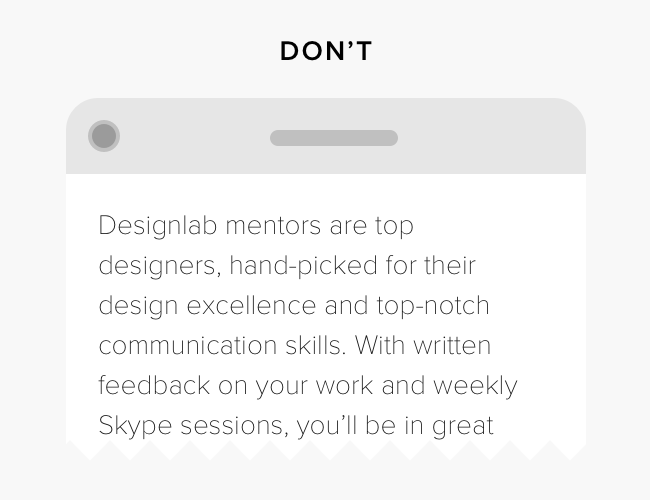
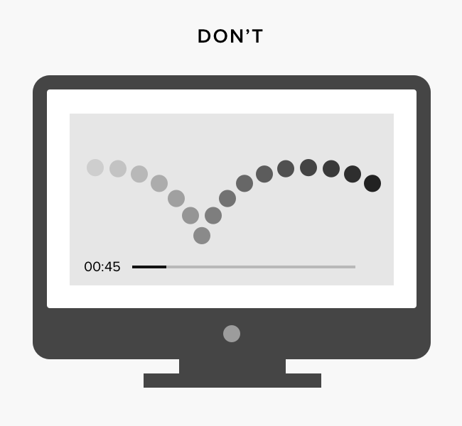
6. Make line length around 50-60 characters on desktop, and 30-40 characters on mobile
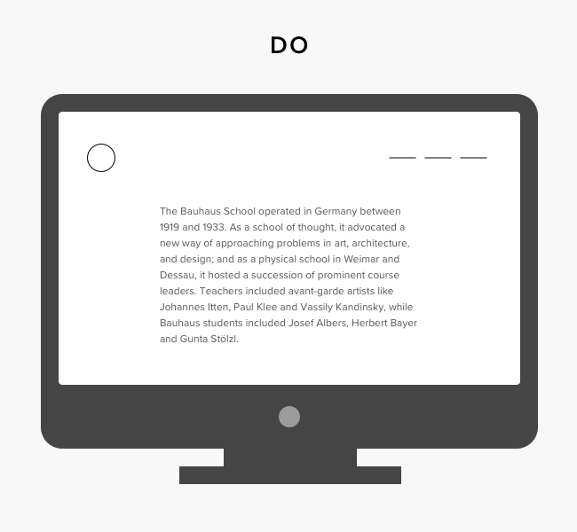
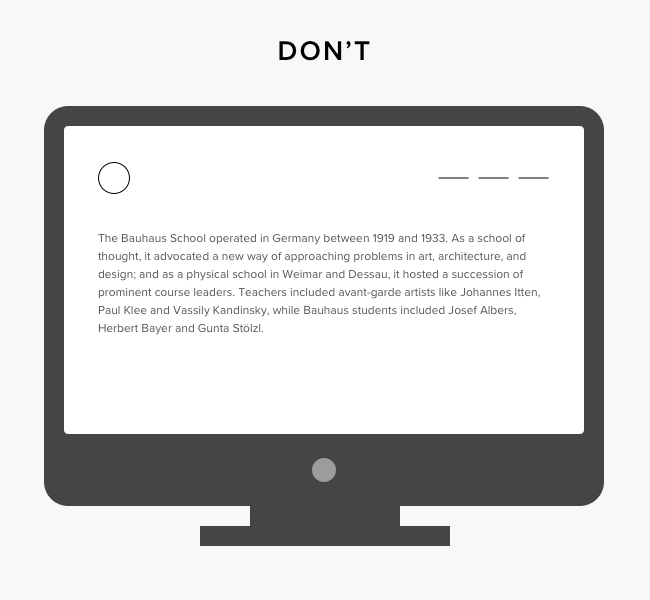
Using a relatively short line length helps the user’s eye travel back to the start of the next line without getting lost. It also reduces the strain of reading a long line, which for some users might require head movements as well as eye movements. However, note that lines that are too short can be just as difficult to read, because they force the eye to rapidly move from one line to the next.
7. Use a line height (line spacing) of at least 1.5 (150%)
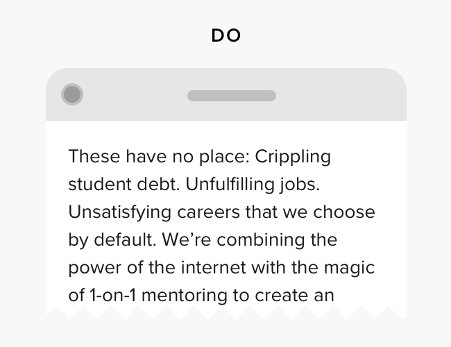
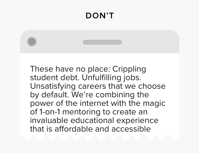
W3 accessibility guidelines recommend using line height of at least 1.5 lines (150%). So for 20px text, that means using a line height of 30px. This serves the same purpose as a moderate line length—creating a clear (but not excessive) channel of white space between lines of text to help guide the eye to the start of the next line.
Line spacing on digital touchpoints tends to be much larger than in books, newspapers or magazines. There are a number of possible reasons for this. Above all, people are likely to be using digital devices from further away than they would read a book (think of a typical desktop computer setup).
Second, computer screens usually produce lower contrast than natural light on printed matter. And third, particularly on mobile, people may be using their device in suboptimal conditions, for example while walking. Generous line spacing helps make reading easier in all these cases.
There are some valid exceptions to this rule. For example, if your design includes text in quite narrow columns (think of the home page of newspaper sites like the New York Times), then it is legitimate to use a lower line spacing, because the eye doesn’t need as much help to return accurately to the next line of text.
8. Choose fonts with a large x-height
The term “x-height” refers to the height of lowercase letters (like x) compared with uppercase letters within the same typeface. Most default interface fonts today—like Apple’s San Francisco and Google’s Roboto—have a large x-height, as do the fonts we use at Designlab (Proxima Nova and Georgia). As a result, the letterforms are larger and clearer for the given text size.
Examples of inaccessible fonts—typefaces with small x-heights—include (albeit beautiful) typefaces like Baskerville. The fonts pictured above are Georgia, a serif designed by Matthew Carter for screen use, and Mrs Eaves, a serif by Zuzana Licko, which is more suitable for print.
9. Avoid light text weights, particularly at small sizes
To be legible for visually impaired users, the letterforms in a font need to be thick enough to create significant contrast with the background color. If a font’s weight is too light (thin), the text becomes very hard to read.
More resources on inclusive text and typography
- To choose the right typeface, look at its x-height (Ricardo Magalhães)
- Your body text is too small (Christian Miller)
- Size Matters: Balancing Line Length And Font Size (Laura Franz)
- Readability: the optimal line length (Christian Holst)
- Why you should go big with line spacing (Damian Jolley)

Color and Contrast
10. Use high-contrast color combinations


“Contrast” in the context of accessibility doesn’t mean contrasting hues (e.g. blue and red), but rather contrasting value—which refers instead to the relative light and dark of two colors.
We can quantify contrast in a “contrast ratio”. The AAA standard in W3 accessibility guidelines requires a contrast ratio of at least 4.5:1 in large elements, and at least 7:1 in regular elements. (Note that these requirements don’t apply to decorative elements like logos and illustrations.)
There are some online tools that allow you to check the contrast ratio of your color choices, including WebAIM’s contrast checker and Colorsafe. Also, Stark is a useful browser plugin that allows you to check the contrast of any two colors.
Another approach to sense-checking the contrast in your design is to look at it in a desaturated view. To do this, export your design as an image file, open it in Photoshop, and then desaturate the image (Image > Adjustments > Desaturate). This removes all color information apart from value (light and dark), allowing you to assess contrast without being distracted by hue.
If you choose not to get into technical contrast levels, just remember that black and white have the greatest contrast on screens, and is generally the easiest combination to read. Any step away from black and white represents a reduction in contrast, and gradually makes a design less inclusive.
11. Avoid problematic color combinations for functional elements
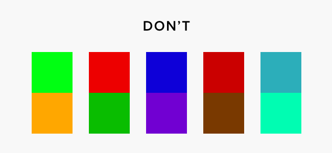
Around 1 in 12 boys and men, and 1 in 200 girls and women, suffer from some form of colorblindness—that’s 5% of all users. The most common forms of colorblindness mean that affected people may find it hard to distinguish between:
- green and orange
- red and green
- blue and purple
- red and brown
- blue and green
It’s particularly important to avoid difficult color combinations where the colors are functional in some way–for example, where they are used to color-code a map, or to indicate the function of buttons. Using red and green to indicate “stop” and “start” in an interface could be very problematic for a person with colorblindness.
12. Support color choices with patterns, icons, and text labels
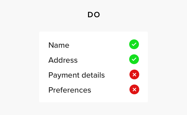
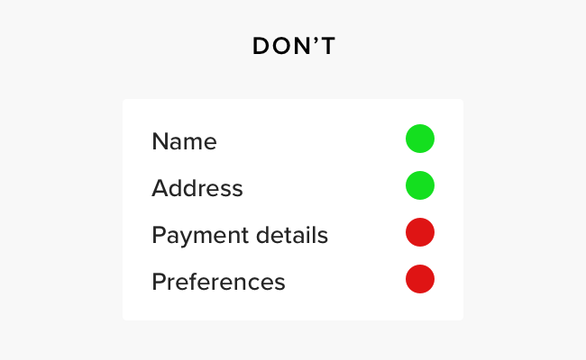
Another way to ensure that color choices don’t become an obstacle for users with colorblindness is to make sure that all meanings are also conveyed in a second way. For example, instead of using only color to indicate status, we could combine the color with icons like a check and a cross.
In other contexts, we can supplement color with different shading patterns, text labels, and outlining. For instance, by using a thicker line around form fields that are in an error state, we accommodate the needs of users who can’t see that the outline color has changed to red.
And in product copy, if referring to interface elements, take care not to refer only to their color—say “press the round button to start” rather than “press the green button to start”.
13. Consider autistic spectrum disorders when choosing color schemes

Around 1 in 160 people has an autistic spectrum disorder, and research has found that the color yellow can be distressing to some people in that population, being associated with sensory overload. Consider avoiding the use of yellow, or use it sparingly.
More resources on inclusive color and contrast
- Types of colorblindness
- Take Enchroma’s color blindness test!
- Stark, a browser plugin to measure color contrast
- UseContrast’s guide to text contrast
- Colorsafe helps you build high-contrast color palettes
- WebAIM’s contrast checker
- ColorOracle is a free colorblindness simulator
Navigation and Interaction
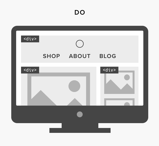
14. Plan a clear and relatively linear visual hierarchy
When it comes to making a design accessible to all, don’t overlook the importance of first planning your content and deciding how it will be organized. Then, reflect this information hierarchy in a clear visual hierarchy that takes the user’s eye on a natural journey through the content. Using Gestalt principles (principles of grouping) helps to organize related items and support visual hierarchy.
15. Avoid hiding content
If you have minimalist tendencies, it can be tempting to try and remove anything that feels like visual clutter. This can be good when it comes to simplifying decoration and styling, but problematic if it means obscuring functionality. Common ways that content is unnecessarily hidden include the use of question mark icons or tooltips to hide helper text.
If you’re hiding content to create hierarchy between primary and secondary content or functions, consider using a menu or an alternate text style that adds hierarchy without introducing a barrier to usability.
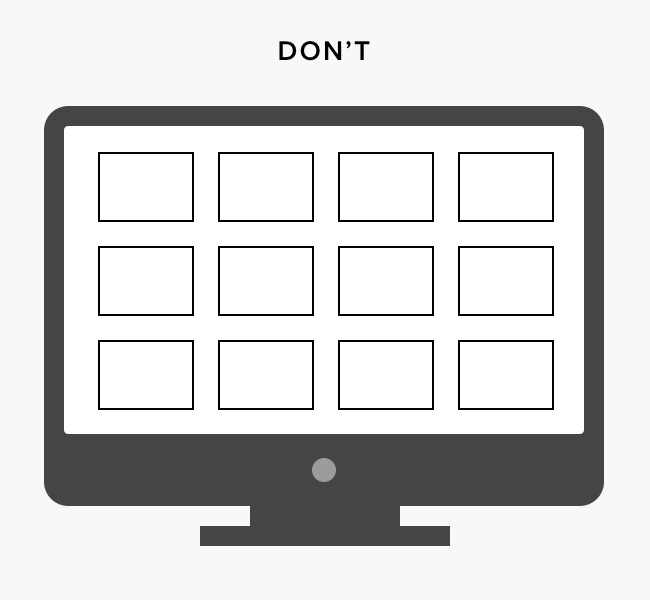
16. Keep button and link text short
Screen readers will read out all of the text in links and buttons. A link that covers a whole paragraph of text can therefore be seriously frustrating. Keep button and link text short to avoid creating this problem for users.
17. Make buttons and interactive elements big enough to tap


Many websites use buttons that are too small to tap for the average user—a sure sign that these elements are seriously problematic for anyone with impaired vision or motor function. Web standards require that any touch target be a minimum of 44*44px, though Google recommends a minimum of 48*48px.
The tips on text size above apply equally to buttons. Use plenty of padding and spacing to ease these interactions; on mobile, it’s also a good idea to make the button span the whole grid width.
Note that W3 guidelines also forbid nesting one control inside of another—so, for example, you shouldn’t have a button within a card that links to a different destination or action.
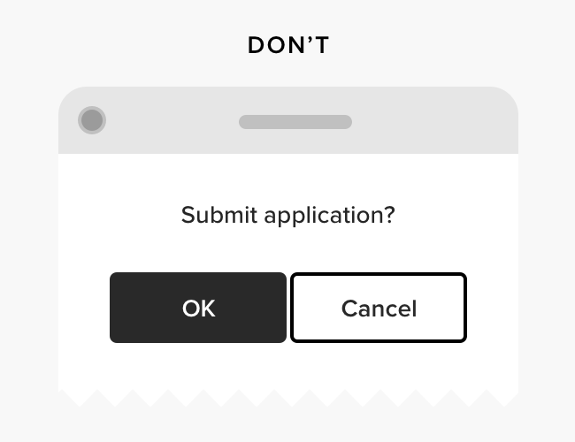
18. Forgive user error
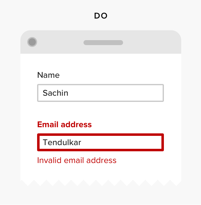
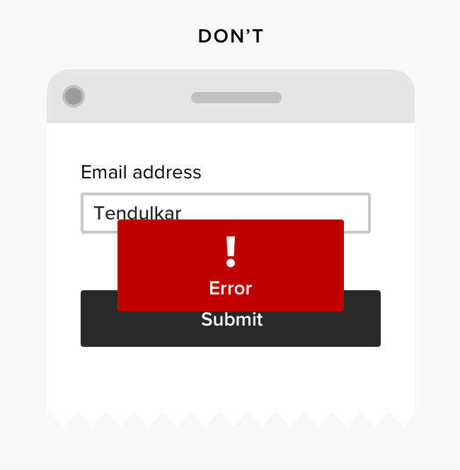
If a user makes an error, the system should forgive that error and facilitate correction. For example, if a user puts the wrong information into an email address field, the system should help the user to fix the problem rather than generating a non-specific error message, or even breaking the form completely.
19. Make sure that there is clear space separating touch elements
Google recommends that touch elements should be separated by at least 8px of space. As well as making it clearer that the controls in question are indeed separate ones, this also reduces the risk of the user accidentally tapping the wrong option.
20. Support user understanding through affordance and feedback

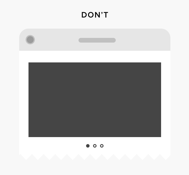
In UI design, an “affordance” is a design pattern that provides a hint about how it can be interacted with. For example, where the user can swipe through a carousel of images, we can hint at that functionality by displaying the start of the next image at the edge of the screen. Affordances such as these reduce the gap between form and function in digital design, which is particularly beneficial for children and users with certain cognitive impairments.
[MID_ARTICLE_CTA]
21. Design for the context the user is actually in
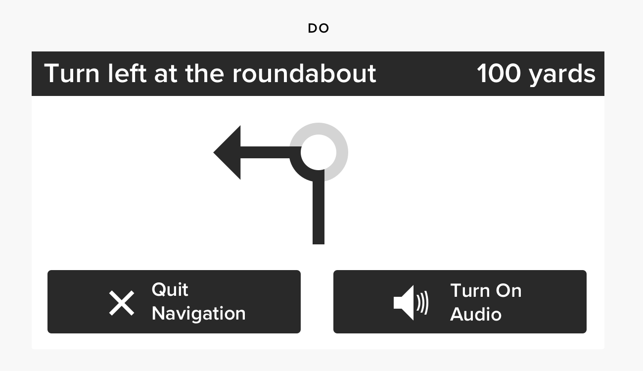
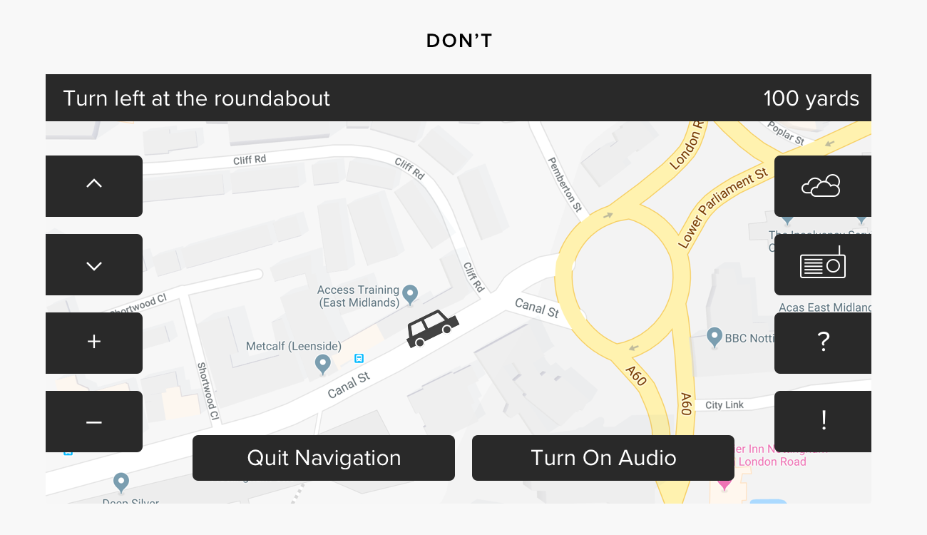
We use digital interfaces in a variety of contexts, and how the interface appears and functions should reflect that context. A very clear example of this principle is touch screen interfaces in cars. Cyborg anthropologist and “calm technology” advocate Amber Case has argued that touch screens aren’t an appropriate interface choice for most in-car tasks.
However, for as long as they exist, designers can work to make them more usable and, therefore, safer. One of the main hazards they present is that, because they present a flat surface to the touch, drivers have to look away from the road to isolate their touch target.
This is made far more difficult and time-consuming if the touch target is small and hard to read—so in any in-motion scenario, we would want to maximize the size of the text and touch elements, and simplify the presentation of crucial information, like the next route instruction.
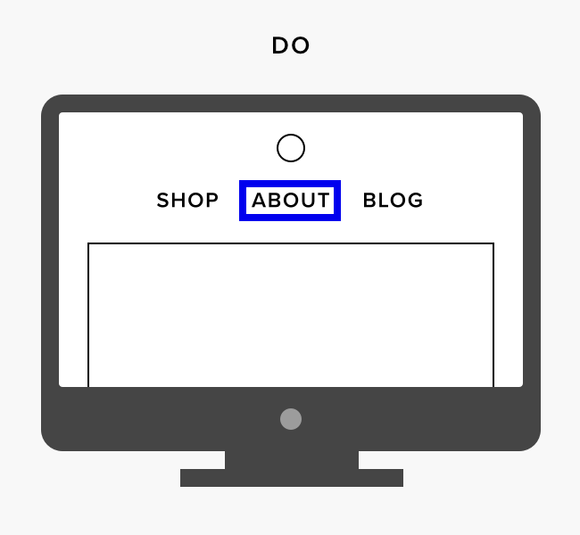
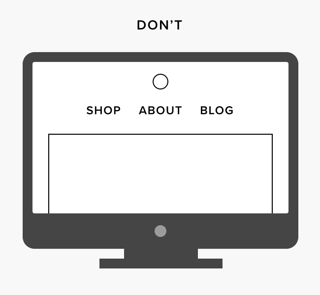
22. Make links looks like links
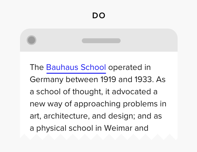
In web design, it can be very beautiful to make links recede as much as possible into the surrounding text. Unfortunately, this makes it harder for all users to identify links, and significantly reduces usability for many visually impaired users.
Therefore, make sure that links are clearly visually differentiated in some way. As per the guidance on colorblindness above, a change of color may not be enough, so combine a change of color with a change of weight, or the addition of an underline. (And no, you don’t have to stick to “hyperlink blue”.)
23. Write inclusive copy
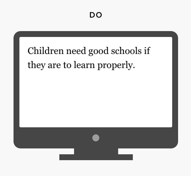

Accessible copy is concise, as free from jargon as possible, and formed of short sentences and well-organized paragraphs. Mailchimp have a fantastic style guide—it’s licensed under Creative Commons, so you can use it as a starting point for your own product. The example above is one of many from the Plain English Campaign, which is based in the UK.
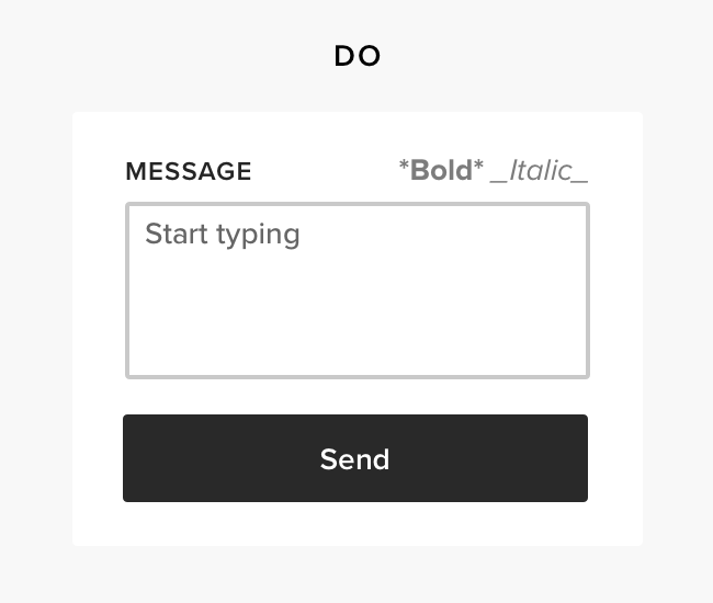
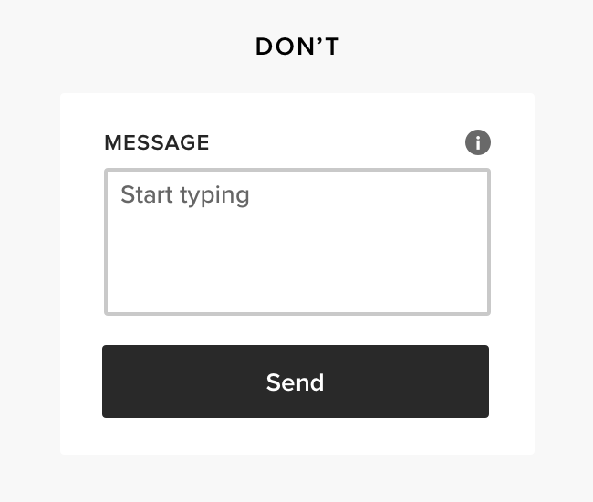
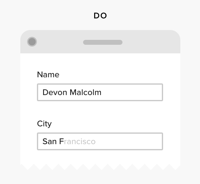
24. In forms, use both labels and placeholder text
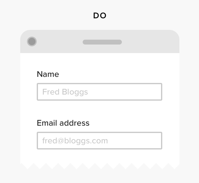
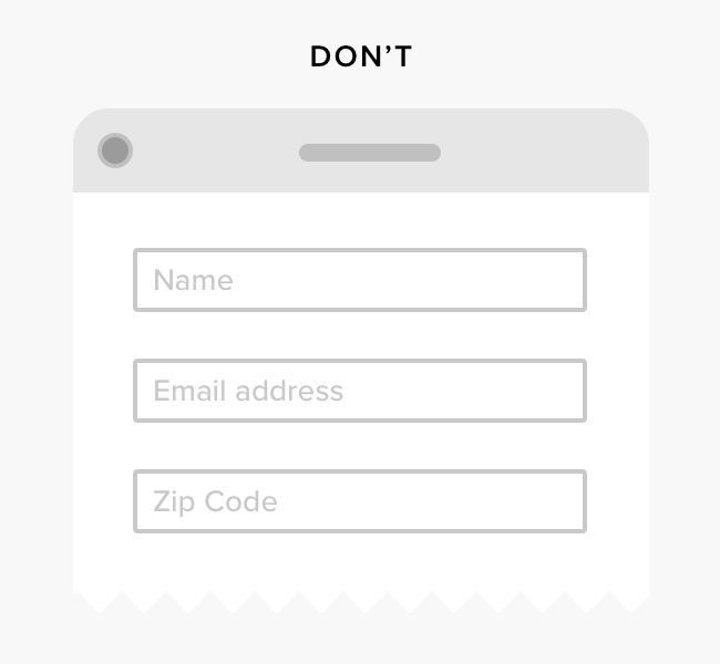
It’s become quite common to see placeholder text used as a label. Although this saves space and may look more elegant, it compromises usability in two key ways. First, screen readers will not read out the placeholder text. Second, it means that as soon as the user selects the field, there are no visible instructions on what they’re supposed to be typing. Make sure to include both a descriptive label, and placeholder text that provides a guide for input.
25. Avoid using dropdown menus, especially on mobile
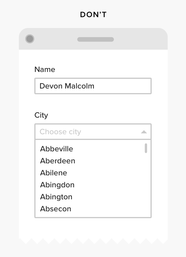
Dropdown menus are often a way of hiding a large number of options. They create extra physical and cognitive steps for the user, and are typically much more complicated than typing a response. Talk to your developer to see if you can use auto-complete and inline validation instead of a dropdown.
Dropdowns are especially problematic on mobile, as they tend to produce popup modals that are often unreliable to interact with, particularly on websites.
Pssst! Want to learn more about designing inclusive forms? We’ll soon be publishing a detailed guide. Sign up to our newsletter and we’ll keep you posted!
More resources on inclusive navigation and interactions
- Gestalt Principles in UI Design (Eleana Gkogka)
- 12 Writing Tips for Non-Writers (Designlab)
- Plain English Campaign
Scalability
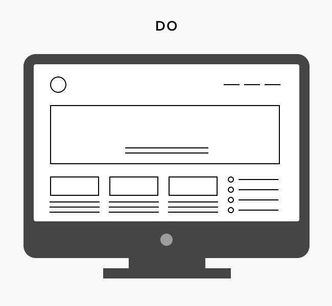
26. Create fully responsive designs
Over half of all web use is now on smartphones and tablets. The screens of these devices are dramatically smaller than laptops and desktops, and we typically interact with them completely differently—using touch rather than keyboard and mouse.
Rather than “adapting” a desktop design for a mobile device, or vice-versa, as designers we should consider all device form factors in our overall plan for an interface’s design. Make sure to consider more extreme cases as well: for example, make sure that your website is still truly responsive to very large screens and very small mobile screens like the iPhone 5.
This could mean allowing a website’s grid size to jump up to the full width of an HD or 4K screen, and for the body text size to increase accordingly—perhaps up to 24px or larger.
27. Make your layout zoomable and scalable
Thoroughly test how your interface responds to zoom, and, of course, don’t disable zoom on a website. The layout should remain usable, without any broken or overlapping elements, when zoomed in using browser or device zoom functions on either desktop or mobile.
If you’re designing an app, make sure it responds to the user’s device settings for text size, and includes native zoom and sizing options if appropriate.
Images and Videos
28. Minimize image file sizes
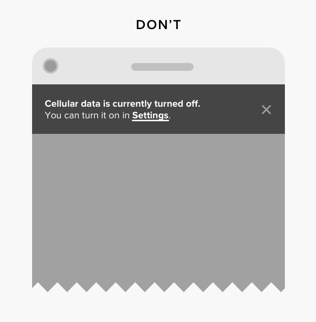
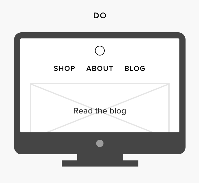
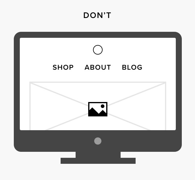
Unexpectedly loading a webpage with a lot of high-resolution images that auto-load can be a slow and costly experience. As a general rule, all photographic images should be below 1MB.
Photographic images (JPGs)
For photos, or images containing a significant amount of photographic material, use a .JPG format at the highest viable compression setting for your image. To set compression level, open an image in Photoshop, hit Save As, and select JPEG.
We usually find that using a compression level around level 8-10 dramatically reduces file size without a substantial effect on image quality in most cases. However, be careful not to over-compress images, because this can cause compression “artifacts”. Pixelated or low-res images can be just as much of an accessibility issue as excessively large files—so you may need to strike a balance between file size and image quality.
Another trick to try here is to use a much higher level of compression (quality level 4-6), but save the image at double the required pixel resolution.
Web graphics (PNGs and SVGs)
The PNG style type—which stands for Portable Network Graphics—is a “lossless” format optimized for web graphics that contain large blocks of similar color. PNG is categoricaly unsuitable for photographic files, because the compression algorithm will result in very large files.
But when it’s used for its intended purpose—web graphics—the PNG format can create very small files at a higher quality than the JPG compression algorithm, which is likely to create artifact when presented with large blocks of the same color.
Even more economical and higher fidelity are SVG files (Scalable Vector Graphics). These are now supported in most browsers—just make sure to convert any text elements to outlines before exporting your SVG, as otherwise text within your SVG file may display incorrectly. The big advantage of SVGs is that they can be infinitely resized without pixelating.
GIFs vs HTML5 video
Animated GIFs are all the rage—but they can also result in very large files. Wherever possible, consider converting the GIF to HTML5 video. This will usually result in smaller files and quicker loading, as well as giving you more control over autoplay settings on most platforms.
29. Use retina-ready images
Pixel dimensions should be twice the largest required view of the image for crisp resolution on all screens. For example, on this page, our illustrations are displayed 650px wide on desktop, so we create image files that are 1300px wide.
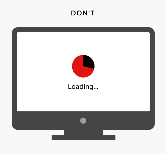
30. Take care with animation and flashing content
Excessive animated content—including GIFs—can be annoying and distracting for any user. In addition to this, some users are at risk of epileptic seizure or motion sickness in response to animation. Avoid flashing content in particular, but if you do use it, restrict it to a flash rate of under three times a second.
Scrolljacking is generally bad news when it comes to designing for inclusion. Although parallax scrolling is usually fine, more aggressive forms of scroll manipulation tend to remove control from the user, and introduce unexpected and rapidly accelerating and decelerating animations into an interface.
31. Include transcripts and captions in audio and video content
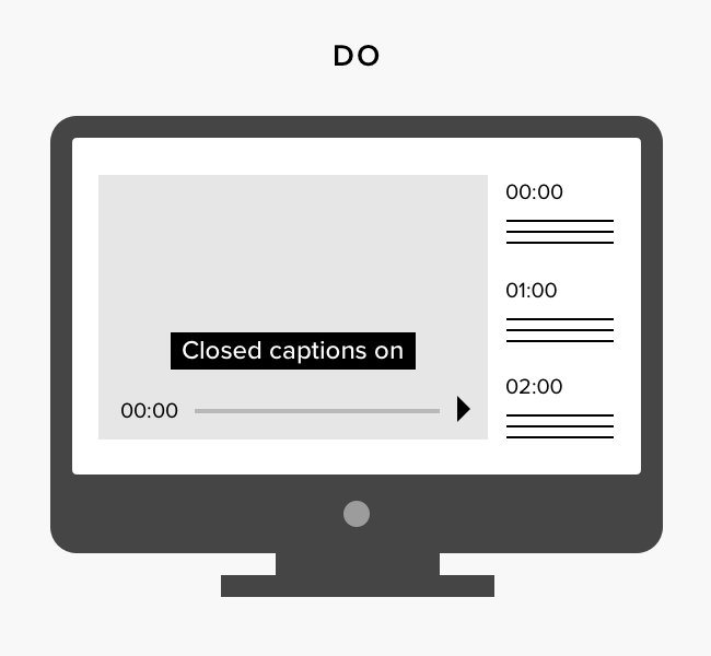
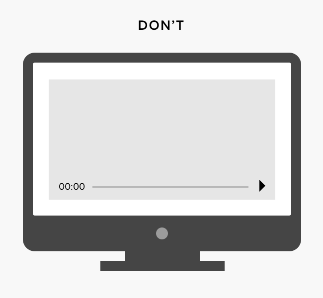
It can be great to include audio and video content in your design, and this is especially helpful for users who struggle with reading. However, make sure that you also support deaf people and others with hearing impairments by including captions with any video content, and transcripts with any audio or video material.
32. Don’t use Flash
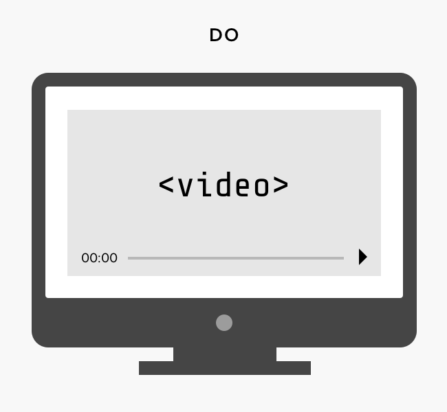
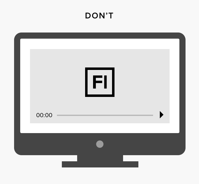
Flash is nearly obsolete on the web, and will soon become officially obsolete. If including video, make sure to use modern HTML5 video standards rather than Flash video.
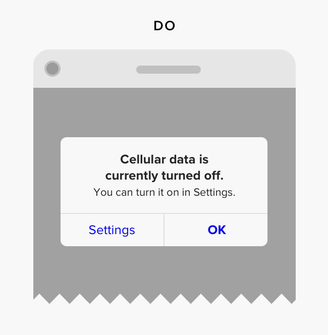
33. Don’t pre-load videos on mobile
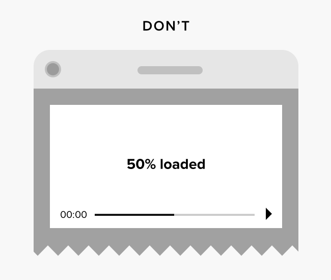
Pre-loading video on mobile can rapidly waste a user’s data allowance. Unless they have specifically chosen to pre-load video content on mobile, avoid doing so.
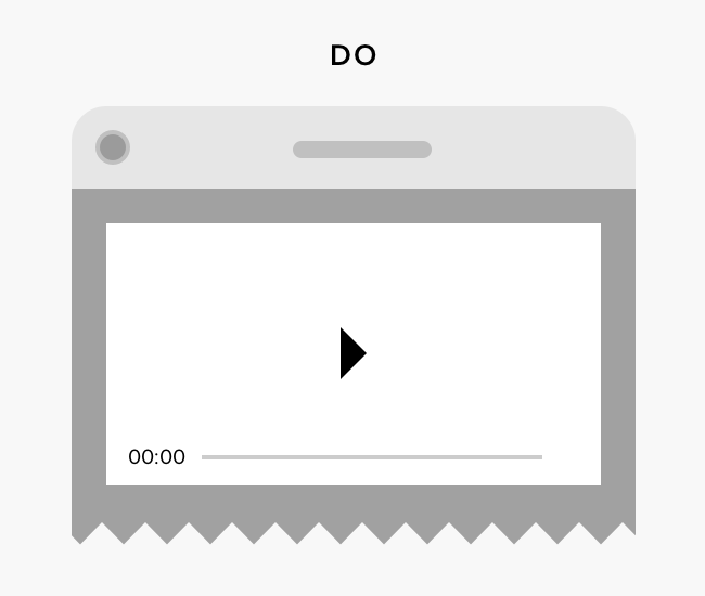
34. Don’t autoplay media
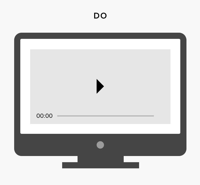
Autoplaying video and audio is generally annoying, and where users are working across multiple apps or tabs, it can be hard to identify the source of the media to hit pause. Avoid autoplaying unless there is a very good reason, or you know that it is what the user expects to happen next.
There are some exceptions to this rule—for example, if you’re using a video as an animated background for a webpage, it should autoplay.
Engineering and Markup
35. Don’t use tables for layout

Thankfully, the use of tables to lay out webpages is now pretty rare, but it still happens occasionally. When tables are used for layout, they cause particular problems for people using screen readers, because they will treat tables as data, and read out their content row-by-row.
36. Minimize bandwidth requirements wherever possible, and optimize load time
Not all users have fast internet, many have very limited data allowances on mobile, and in the developing world data use can be extremely expensive. In an office, you'll usually have nice computers and high-speed internet, but that probably doesn't match the same experience as many of your site's visitors.
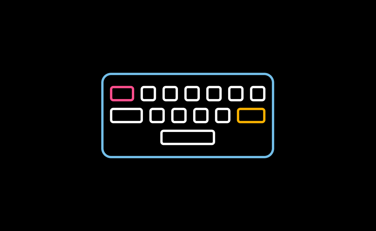
37. Accommodate focus states and tab and arrow key functionality
Users with impaired mobility or motor function may struggle to use a mouse or other conventional pointing device. For these users, being able to move between fields, links, and buttons within a webpage or user interface by using the tab and arrow keys can make the difference between a page being usable and unusable.
A user should be able to see which element is selected (or in “focus”) when using the tab and arrow keys to navigate between elements. In most browsers, a default focus state is set, but you can customize this in a way that fits with the visual design of your website. The focus state can be customized using CSS, but make sure that your customization represents an accessibility improvement. Don’t remove the focus state, as it is crucial to usability for certain users.
When working with developers, specify and test this keyboard functionality. Other considerations include making sure that using the tab key cycles through page elements in the correct order, and that the enter key successfully submits forms where appropriate.
38. Use native elements
Particularly when designing apps, use controls that are native to the OS that you’re designing for. This isn’t only about consistency—the user may also have customized their device UI to appear a certain way. You can download official iOS and Android UI kits.
39. Always use the “alt” attribute in non-text elements
The “alt” attribute specifies what text will replace non-text elements like photos. Alt text is displayed either when these elements fail to load, or when someone is using a device like a screen reader. (A side-benefit of using alt text is that search engines will more readily index that image, and boost the keyword performance of the page.)
Note that alt text can be associated with any non-text element—not only photos, but also videos and other media. Bearing in mind that screen readers will read out all of the alt text, make sure to keep it short—a few words is enough. And when the alt text is associated with an active element (e.g. a linked image), the alt text should describe the action, not the content of the image itself.
For more details, check out Ability Net’s five golden rules for compliant alt text.
40. Validate your markup for accessibility
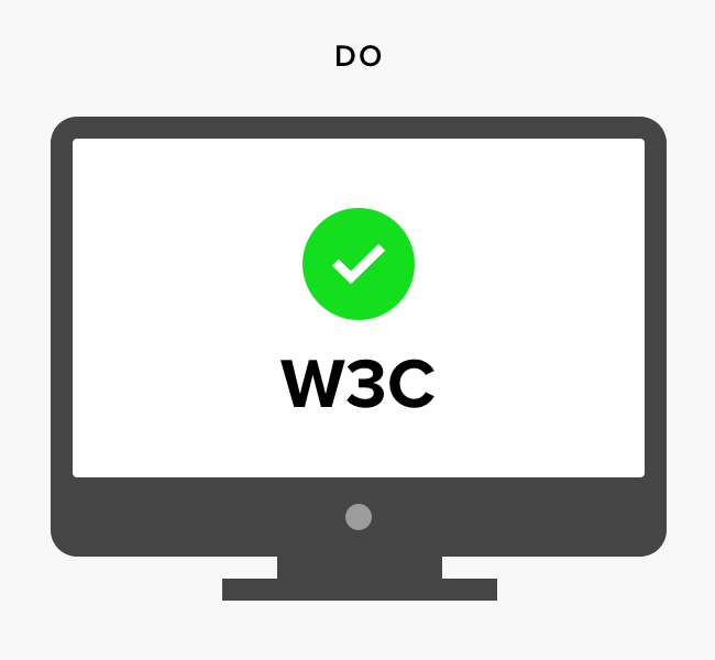
W3 has a free markup validation tool that will help to identify any technical barriers to inclusion, like missing “alt” text.
More resources on inclusive markup and engineering
- Ability Net’s five golden rules for compliant alt text
- Download official iOS and Android UI kits.
- W3 markup validation tool
Download the Inclusive Design Checklist
Get it here.


%20(1)-min.png)


